Trends come and go. That’s why it’s important that you keep up with business card trends if you want to continually portray an up-to-date look, especially when handing them out to potential connections or clientele.
We experience technological advancements at a steady pace. As a result, changes are constant in our society. A prime example of such change is how the internet has affected how we conduct business these days.
Thanks to the ever-present internet, many professionals have steadily shifted from physical meetings to digital ones. Aside from correspondence, we can also do commerce online. These are only two of the many things that we can do with the internet on our side.
However, it’s important to note that society can’t leave every bit of traditionality in the past. We still need some of it, like the business card.
Business cards are essential to a person’s or organization’s branding. It doesn’t matter what field we find ourselves in; the business card will represent us and expand our networks if designed tastefully.
With this in mind, we need to choose our business card designs carefully. These ten business card design trends for 2020 can be an excellent starting point for those at a loss.
Monochrome Business Cards
A trend that will forever remain a timeless classic is the monochrome business card. A monochromatic theme offers a clean and sleek look that can fit any position, company, or industry.
When considering this trend, it’s essential to recognize the misconception that comes with the design. Many believe that things in black and white are bland and boring. It doesn’t have to be that way for our design choices since we can use modern approaches to spice up our business cards.
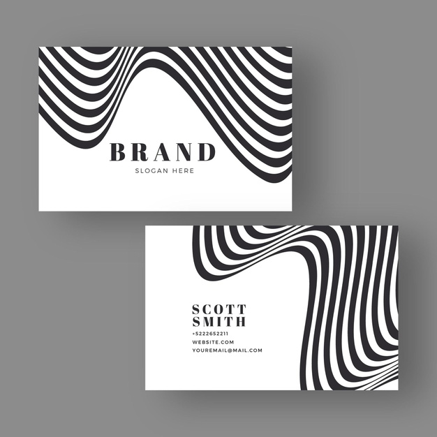
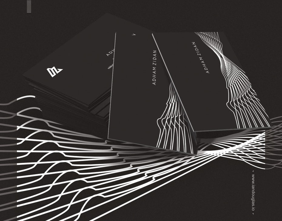
For those unsure how to start their monochrome business cards, the models below are great examples. Both use distorted lines to create eye-catching designs.
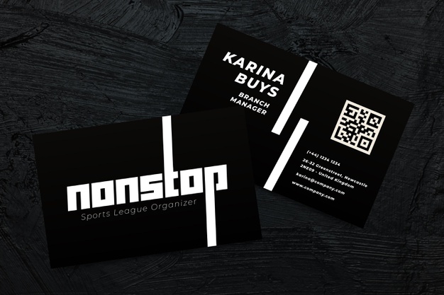
Aside from distorted lines and shapes, another element we can use is striking logos. The business card below comes with one so bold and unique that it automatically attracts the gaze. At the back of the card is a QR code for the company — another unique design choice.
There are other elements we can use to spruce up our designs. Unique materials, embossed designs, autographs — the sky’s the limit.
Minimalist Business Card
Sometimes less is more. We can apply this philosophy to minimalist business cards.
It’s easy to confuse minimalist designs with monochromatic ones considering how there are so many monochrome business cards that are also minimalist. The difference between the two is that minimalist business cards can be colorful business cards, not just black and white.
Below is an example of such a card. With just a glance, we can garner that what sets this business card apart from other models is the vibrant yellow shade the designer used for the base of the card.
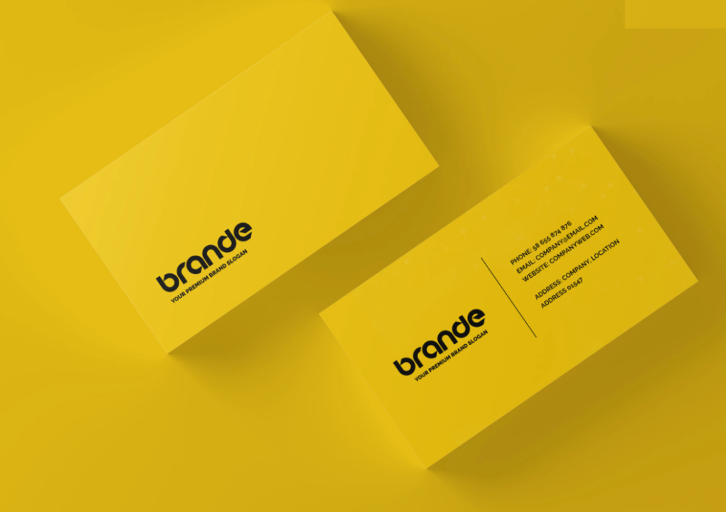
Aside from the stunning base color, the business card also utilizes a bold, black font for its logo, which pairs well with the loud color.
The second example we have for a simple business card showcases how minimalism works well with the monochromatic color scheme. The model below may be in black and white, but the embossed and debossed material of the card offers a unique touch to its design.
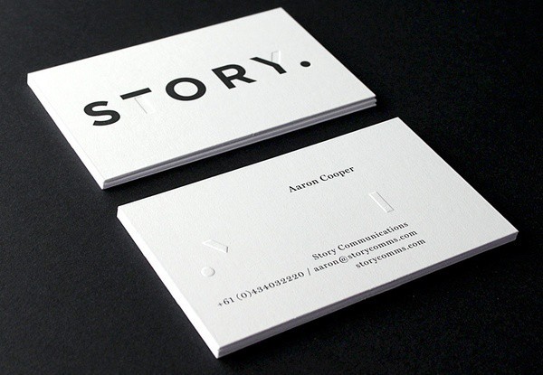
Minimalist business cards may be daunting to use at first. However, if we choose enough distinctive elements, we can make these cards uniquely attractive.
Hand-Illustrated Business Cards
One fo the business card trends that has risen in popularity in recent times is hand-illustrated business cards. Individuals who incorporate unique hand illustrations to their cards will come up with softer, more engaging models.
This business card design is a perfect option for professionals working in the field of visual arts. Using art pieces that we have created will boost our brands because they’re necessarily sneak-peeks to offer possible clients and colleagues.
The business card below is the perfect example of an artist using the hand-illustrated business card to its fullest potential. They match it with a clean, easy-to-read font to balance out the design.
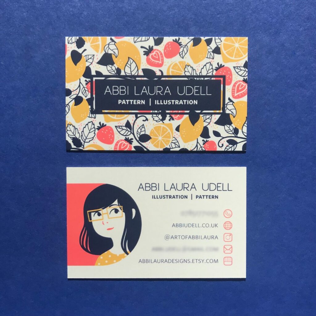
It’s good to remember, though, that this trend isn’t just for artists only. Even individuals belonging to other fields, like STEM, can use hand-illustrations so long as they have been designed appropriately and in the context of their profession. See the business cards below.
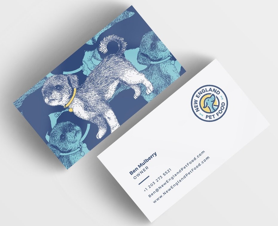
Another bonus we can get from using illustrations is that they work well with other business card trends. The minimalist card below gets extra oomph from the drawing used.
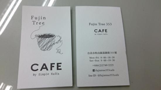
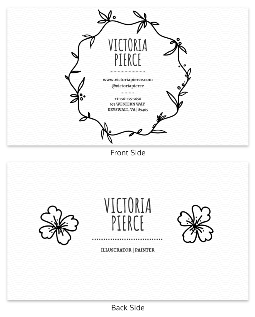
Some may raise an important question: “When is it appropriate to use this trend?” Some people may believe that “serious” careers in the medical or business field have no use for illustrations. However, so long as it’s incorporated tastefully, then it’ll be fine. An example is the business card below.

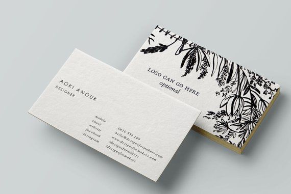
A final note: professional designers may advise that using an illustration in context is the best. However, we can also use them for decorative purposes only. See below.
Die-Cut Business Cards
Traditional business cards are rectangular and follow the standard 3.5 x 2 inches for dimensions. They also usually come with sharp edges. However, thanks to the process called die-cutting, many designers nowadays go against the norm.
In simple terms, die-cutting is like using cookie cutters in baking. The dies in the machine come in different shapes, which are then pressed into the paper to create the said shapes.
Die-cutting has been around for centuries. People first used it in the 1800s for the shoemaking industry. Thanks to the improvements to methods and machinery, we can now use the same way to design our cards.
Among all the design trends, business cards that come in unconventional shapes are the most intriguing since they’re so different from the traditional business card. Below are some examples.
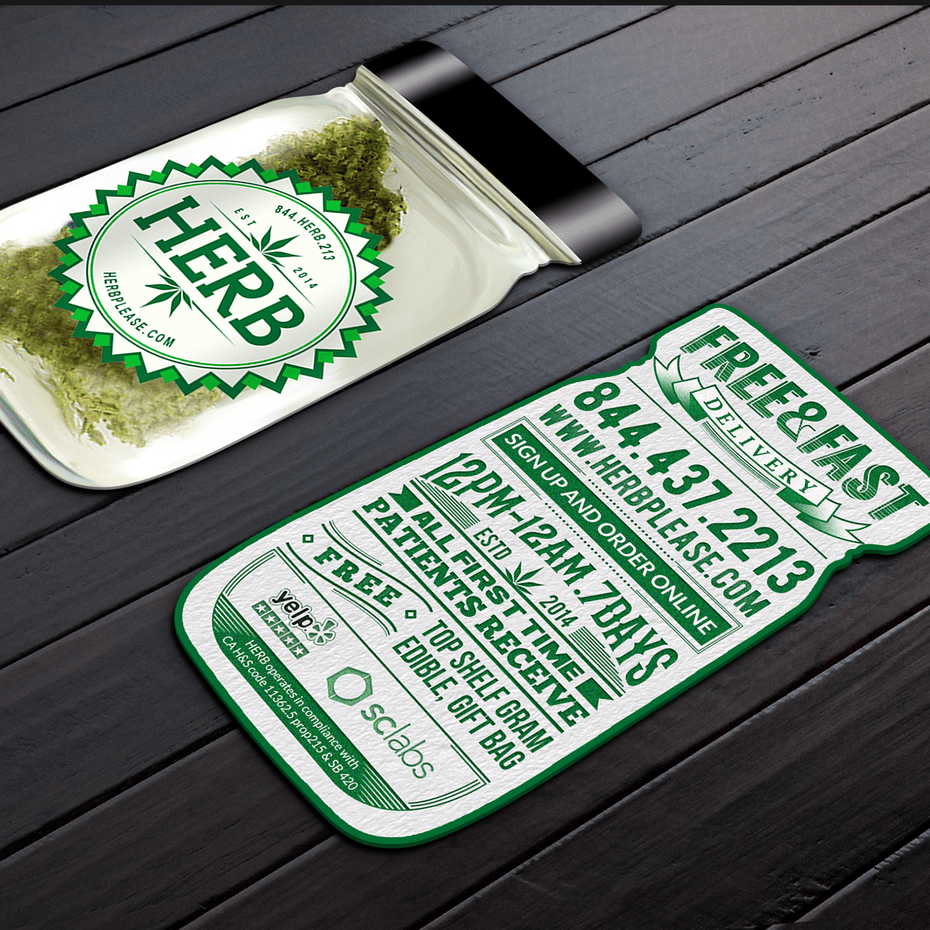
This restaurant uses a die-cut card to create a look resembling a jar of herbs. A realistic image of herbs accompanies the jar shape in front, and a green theme with bold fonts at the back completes the look.
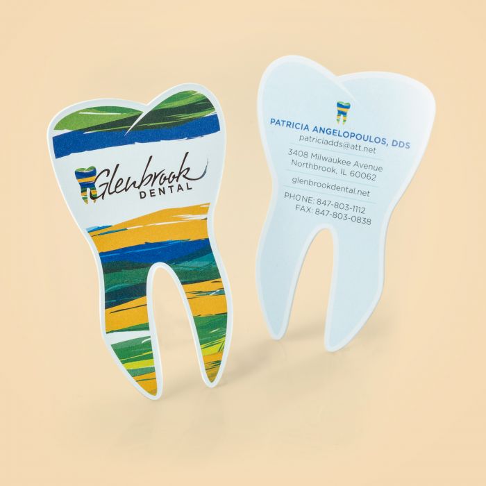
This tooth-shaped business card is perfect for dental clinics. With just a glance, anyone will know what kind of establishment this business card represents.
Read More: 10 Things Your Business Card Should Have
Painted Edges
Unconventional shapes aren’t for everyone. If you already have a design in mind and need an extra oomph to complete it, why not consider painted edges?
This design trend is known to spice up any business card, be it traditional or modern. Painted edges help designers of the card play with three-dimensionality, improving the business card’s overall look in an understated way.
Below, we can see different business cards utilizing this design trend.
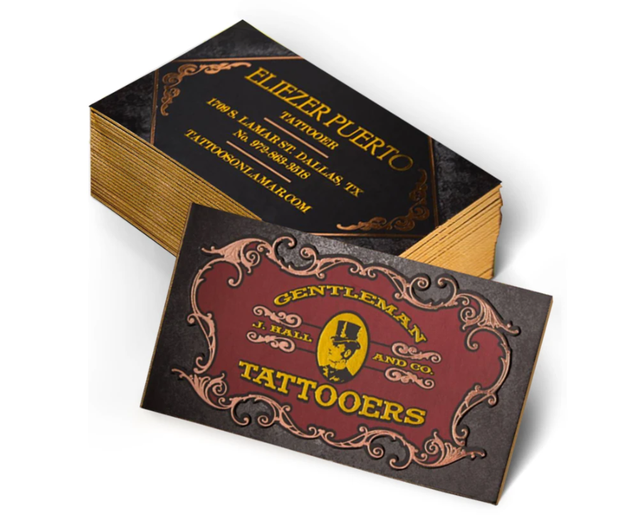
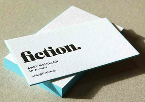
Given the examples above, it’s safe to say that this business card design trend works for any design. It doesn’t matter if you’re taking on a minimalist approach or not. The card will come out looking good, so long as the chosen color works with your brand and overall design.
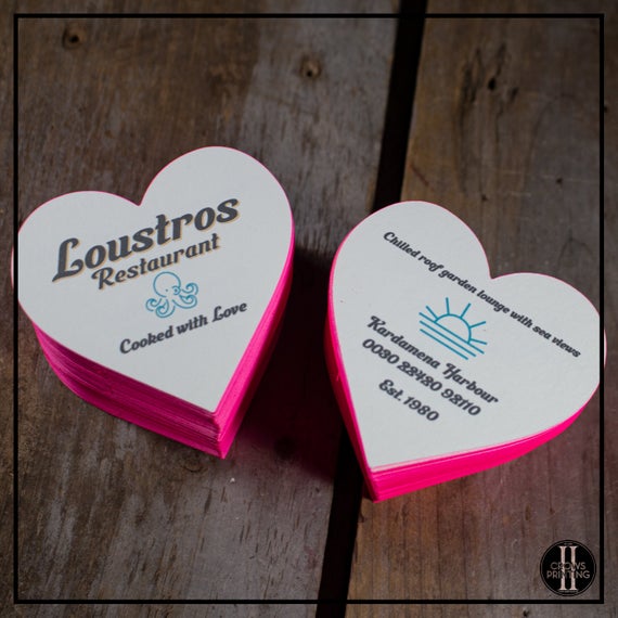
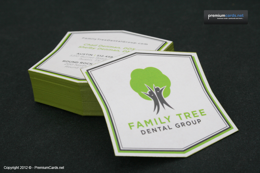
Some may ask, “Can you pair painted edges with die-cuts?” The answer is yes. The right printing company can help you achieve this look. Here are some samples.
Autograph Business Cards
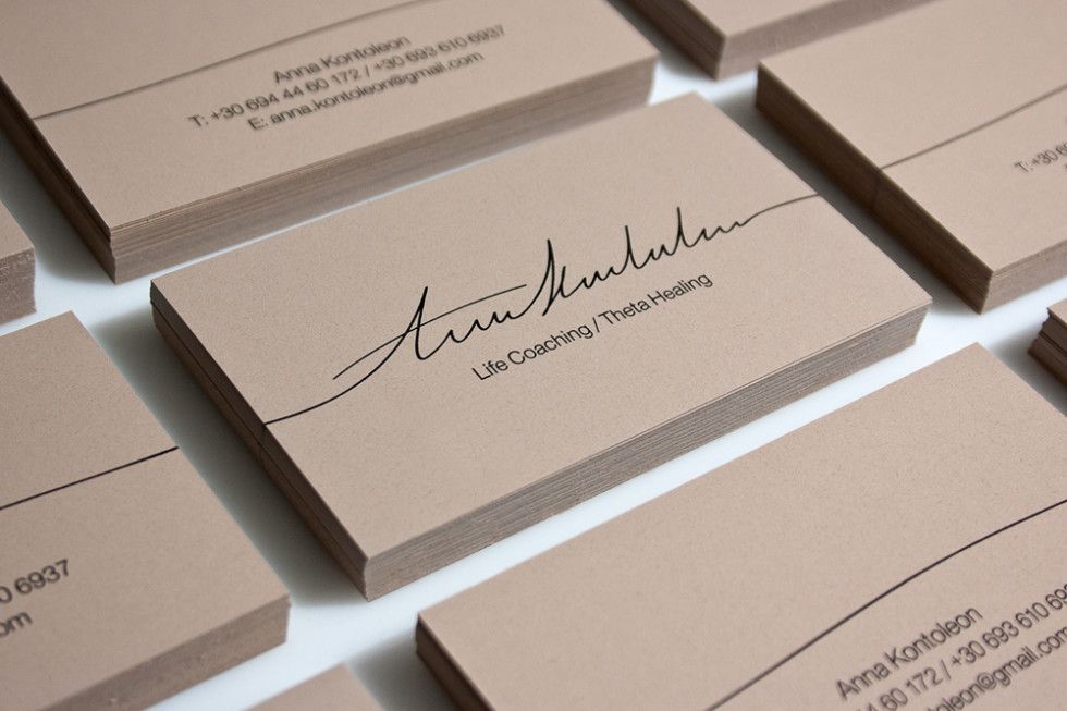
If we go back to timeless business card trends and designs, designers will surely mention the signature. Like the monochrome color scheme, signatures help us achieve a neat and classic look for our business cards. Not only that, but using this trend can help you appear more personal as well.
Those who prefer minimalist designs will be happy to know that signatures pair well the trend. We can see this in the examples below.
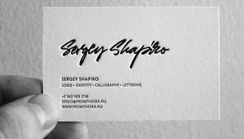
We can also add more flair by debossing or embossing the signature just like this simple business card.
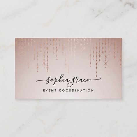
Cards that don’t use the minimalist approach can also incorporate signatures to their design.
Interactive Business Cards
Business cards are often portrayed as dull and unnecessary because all they do is provide details for the recipient, which we can do digitally nowadays.
Knowing this, a lot of brands have become more innovative with their business card designs. Some have made their models interactive, which adds another layer of functionality to their cards.
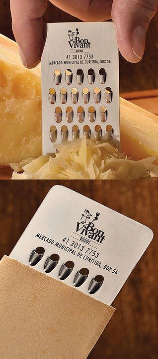
We see Bon Vivant, a cheese shop, market their brand with an expertly designed cheese grater business card.
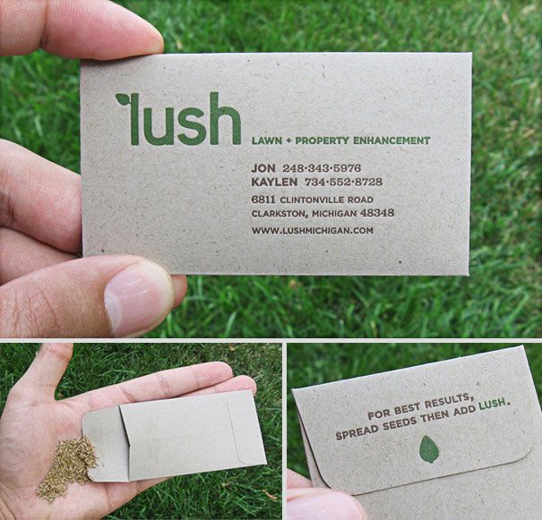
Lush, a lawn and property enhancement company, advertises its services with an organic paper envelope. Opening the envelope will reveal it to be filled with seeds.
The business cards above are examples of brands using interactive business cards within context. However, it’s possible to use this design trend out of context as well.
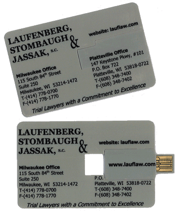
USB business cards, for one, are used by brands even if they’re not part of the computer science field.
Unique Materials
Business cards provide a sensory experience for their users. Sight is the primary sense affected, but it isn’t the only one. Touch, too, can be included depending on what material we use for our card designs.
It’s important to point out that printers typically use paper for traditional business cards. Two of the most common types of paper used in printing are cardstocks and gloss covers. More recently, they’ve started using plastic and stainless steel as well.
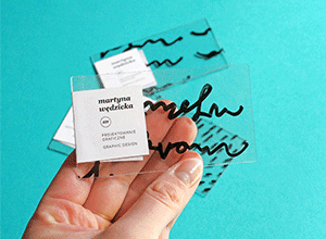
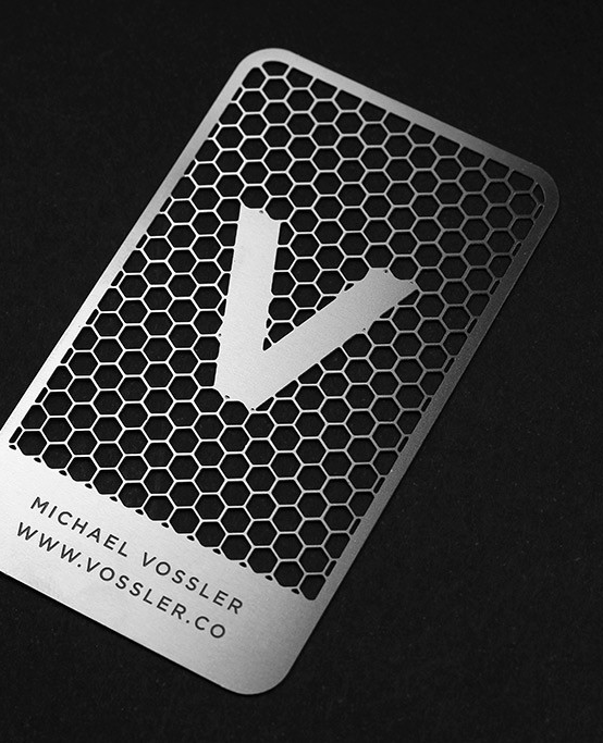
It doesn’t stop there, though. Plenty of entrepreneurs have gone out of the box for their business card materials. Below are two great examples.
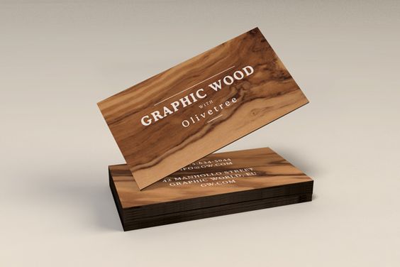
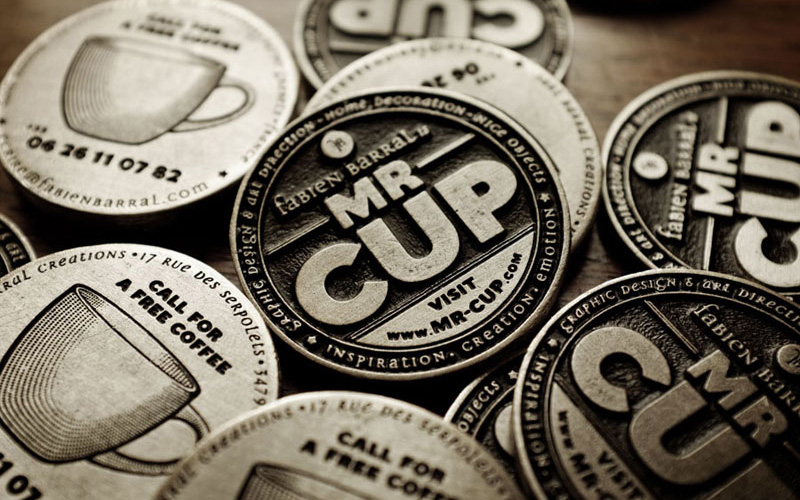
A necessary reminder when using unique materials, especially textured ones: We need to consider minimalism when it comes to other details carefully. Doing so will allow us to showcase the base item better. Also, it can prevent our models from appearing too loud and instead look more cohesive.
Neon Business Cards
Using a bright color scheme in our designs is a business card trend that has been around for ages. It’s simple yet effective, considering how colors naturally draw attention. More so if they’re neon.
For those who prefer boldness over understated designs, neon business cards are the way to go.
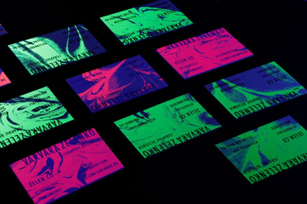
Like all trends, we should tastefully use neon colors. One way of accomplishing this is by considering shades that clash and work harmoniously before using them in our models.
Another note is that bold fonts often accompany neon colors. However, it’s not at all necessary.
Natural Elements
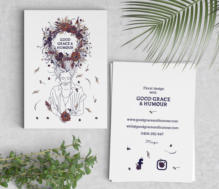
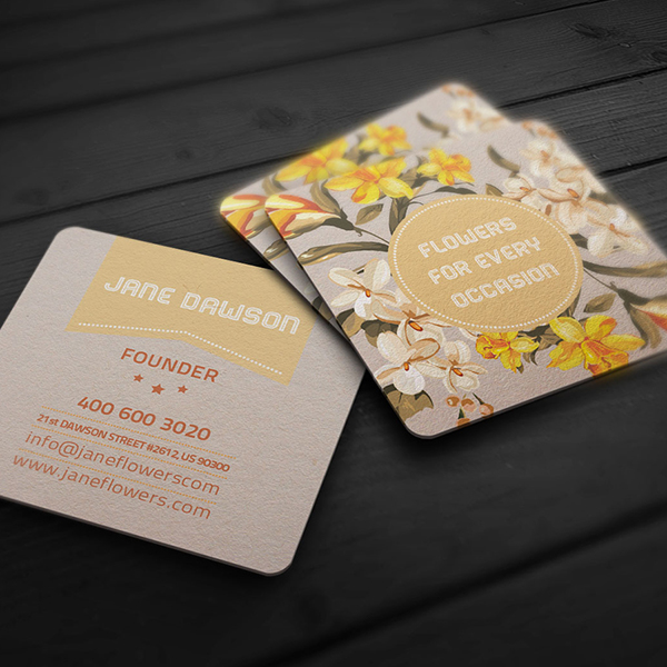
We can consider the last business card trend on this list a classic. Flowers, leaves, trees, and animals are only some of the many elements that make up the nature motif.
Opting to use natural elements in our design creates a bridge to the world around us. When accompanied by the right typefaces and color schemes, these elements can also help us achieve soft yet striking models. See below.
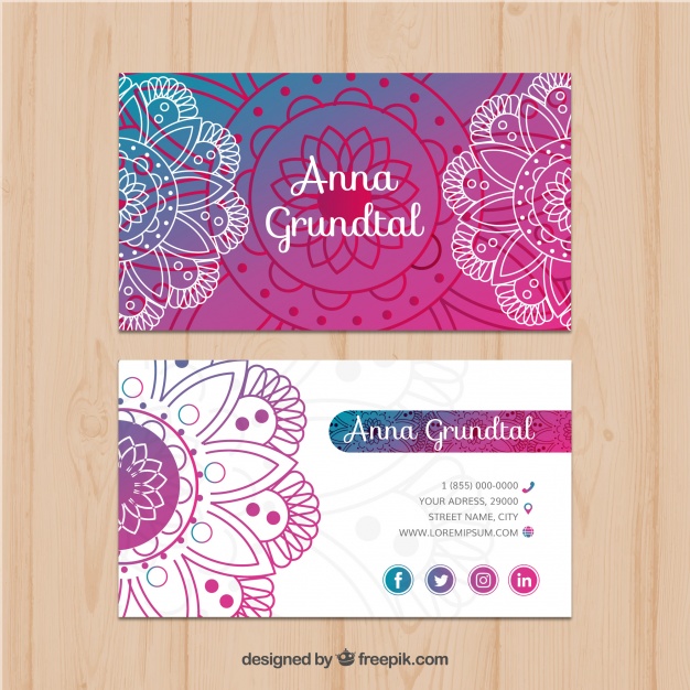
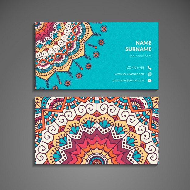
Aside from individual elements, mandalas are also included in this motif. These are a geometric configuration of symbols that commonly use floral shapes.
Brands that use nature in their work use this design trend frequently. Flower shops, event planners, and organic stores are some to note. However, anyone is free to use this motif regardless of the services they offer.
In this day and age, it may appear that the business card’s use is slowly dwindling. However, it’s far from the truth, considering that we can continue to network and promote our brands offline.
With this in mind, these design business card trends are the perfect starting points for designing their cards. In doing so, we must stay meticulous so that we can develop aesthetically pleasing and informative designs.

