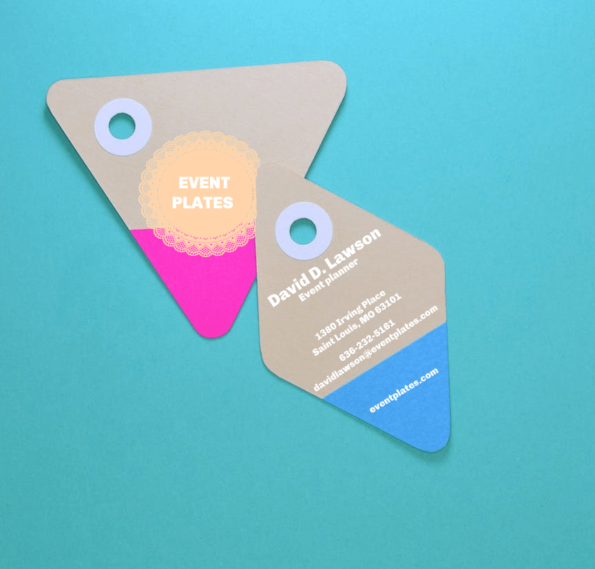
A business card is unparalleled in any industry, and they remain essential for every potential encounter. Nothing can take its place even in today’s tech-dominated world. There is no better way to quickly connect with prospective clients than by handing out rectangular cards filled with contact information. It’s an essential part of the branding and marketing you can do for yourself to stand out in an overly crowded market.
Providing all the data about your job and company in a standard size of 2 inches by 3 inches piece of paper may sound crazy, but you should only provide what is needed. When creating your first business card, nail the basics first. Then, you can now focus on how you can make it eye-grabbing for your potential targets.
To stand out among others, here’s a list of things your business card should have:
1. A unique business card design that generates instant appeal
When creating a business card design, a striking well-constructed one will give you a great first impression. Display a hint of the theme you are opting for while keeping it associated with the industry and company you are in.
However, business cards do not have to be boring; you can incorporate a design that best suits the kind of service or product you offer. Choosing something out-of-the-box can result in making lasting impressions.
2. The important information
Let’s go back to the basics; the core purpose of company business cards or personal business cards is to pass on contact information of an individual to another. Sometimes, professionals get caught up in situations where they input too much unnecessary information, which can overwhelm the design and ruin the business card. Hence, to achieve the well-detailed business card, include only the relevant information to utilize the tiny space, and make more room for the design to make a statement.
The information you need to put in is your name and your job position. Secondly, it is the norm to place all the contact channels, including your email address, mobile number, telephone number, the company’s website, and all the applicable social media handles that they can reach. Lastly, you can make it more official by showcasing your business logo.
3. A recognizable logo
Every business wants to stand out from existing competitors. To make this possible, invest time and effort into getting the appropriate branding tools that can help. Start by designing a logo that can represent the whole business entity. Including a logo on your business card is a way to display your business’s credibility and reliability.
A tip to make the logo recognizable and memorable is by choosing the right graphics incorporated in them. Researching logo designing guidelines from dependable sources can help you make an effective one. After researching, start conceptualizing what you want to put out. You can present it to a panel of constituents to gain feedback and suggestions.
The logo designing process can be a tough one, but it is all worth it considering the benefits it delivers.

4. An effective business card layout
To complete the necessary details and information, you should also take the business card’s layout into account. A skillfully planned business card can take you places. It goes with how you plan out where to place information so the recipient can comprehend and absorb all your data.
You don’t want your audience to have a difficult time navigating through the business card. Thus, keeping the layout minimalistic is the most adept way to do it. If you don’t know where to start with your business card, consider choosing a business card template that is already optimized to be effective.
Also, consider the sequence of information translated into the business card as it will affect how the audience perceives it. You can have the front page designated for the business logo and tagline. In contrast, the other page will contain all your information, including your name, contact details, and address of your company.
Choosing a page orientation will also matter. As most of the business cards people see are landscape-oriented, you can opt for portrait orientation to make it look unique and eye-catching. In different circumstances, you could also try various forms rather than the regular rectangular-shaped to achieve a customized feel. This is one of the business card trends that you can pull off.
Read More: The Best Business Card Template Styles for Young Professionals
5. A suitable color palette
Color transcends ideas, messages, interests, and emotions. For that reason, color develops the quickest first impression of all the elements when creating a business card.
You want clients to think of the design of your business card as your personality. Choosing the right colors for your business card will live you up to that factor. First, you want to refer to a color wheel. You can choose two to three colors and focus on colors with the same hues. Make sure that each one complements each other.
Design business cards with the right colors to connect with potential clients easier.
6. The appropriate font style
We have to take into consideration the readability of the business card. Font style is essential to the content that is inside of the business card. A single font style can communicate the message effectively. It has to go entirely with the flow of the design and style.
For font variations, the lesser, the better. To avoid getting the look of being too crowded, go with a minimum of two (2) varieties. When limiting, it also includes the usage of the sizes of the same font style.
To achieve a more unified look, do not use cursive fonts that take up a lot of space. Go with fonts like Tahoma, Verdana, Helvetica, and Arial.

7. Great feel or texture
Go for high-quality business cards’ papers when creating yours. The thickness should not be too much, just enough to show durability. Avoid scratchy types of photo paper that feel incredibly unrefined. You must invest in where your design gets printed to get the best possible quality. Do not let your effort go to waste with just a piece of paper.
Aside from investing in top-notch papers, apply textures to improve the premium feel to it. To get the perfect finish, give emblem design a try. It creates the idea of being professionally printed.
Just a little reminder to always make it easy to replicate so that you can always produce extras.
8. Meaningful and simple background
It is vital that your audience is able to see and understand your information. Using a minimal yet impactful backdrop is the option to take. Just like in photography, the main object is crucial, but the background or the setting will always get considered. Supposing a business card is a single photo; the background image could emphasize the content details.
Having a minimalist background makes you get rid of the unnecessary things and make more room for the focal point. You can be playful with your background image by lowering the opacity of the image you want to display. Remember not to let yourself get carried away with too much graphic design surrounding your business card’s core.
9. A showcase of the products and services you offer
Taglines are a way to impart the brand message to the audience. One of the purposes of a business card is to get the prospects to avail of the products and services you offer. It is a more cost-effective way than other advertising alternatives. Take the opportunity to advertise by including a hint. It could also be a visual representation by creatively setting it as the background or as part of the graphics.
You can also include a call to action phrases to utilize the opportunity. This is the most strategic procedure to prompt the audience to do the action. For this section, you can use a commanding tone to encourage the reader to take action. Make it sound creative yet concise and clear.

10. Addition of the tagline to your business card
Taglines are a way to impart the brand message to the audience. Even though each year, newer and effective marketing strategies emerge, taglines remain a powerful tool. Customarily, place the slogan near the brand’s logo.
Just like any of your marketing tools, choose a font that is clear and easily readable. To make sure that the text will be as visually appealing as how you want it to be. By choosing appropriate font faces, one can considerably decrease confusion, leaving readers pleased to keep reading the whole content.
Also, consider the art of contrast. Select the best text color that complements all the colors seen in the business card. If the background features dark colors, consider using lighter ones for your text color.
As shallow and straightforward, these factors may sound, but these enforce substantial results for your business cards.


