Let’s talk about logos. Specifically, let’s talk about modern logo designs.
Logos are born when images and text join forces. Together, these two elements make up a design that tells people what you’re all about.
Logos are customers’ and clients’ first interactions with your brand or business. Since first impressions last, companies pull out all the stops to make sure they create memorable ones.
Let’s get one thing straight, though: nobody (except graphic designers and art enthusiasts) puts much stock into company logos. However, that doesn’t give businesses an excuse for sloppy execution. Logos can make or break reputations; people tend to judge things quickly and stick around if they see good designs.
Does your logo need a refresh?
Much like marketing tactics, design trends evolve through the years. These trends influence companies to change their logos to keep up with the clock (and their competition).
Some brands have left their logos untouched for decades. Although they haven’t lost any of their goodwill, they may have lost some of their edge on competitors. Outdated logos stand out in these modern times, but not in a good way. This may lead them to fall behind the pack while others race to be at the design game’s top.
Logo changes don’t have to be drastic. They can be as minor as a typography tweak or a color scheme change. Modifications don’t have to come often, too; just remember to switch things up when your brand needs a refresh.
Going Modern

Brands nowadays employ modern logo designs to keep up with the times. Luckily for them, modernism’s aesthetics fit theirs.
What makes a design modern?
People usually associate modernism with current times. However, modern designs aren’t all that new—fun fact: it refers to a design movement that lasted from the 1900s to the 1970s.
Unlike maximalism, modern logo designs prioritize functionality as opposed to form. This paved the way for sans serif typefaces, grids, and minimalism. It also saw the inception of submovements such as Bauhaus and futurism.
4 Examples For Inspiration
Less is more when it comes to modern logo design. This approach results in a clean, minimal, simple, and striking appearance. Not only are modern logos a hit among young companies—established brands use them too! Take a few cues from these powerhouses and see if their aesthetics fit your bill.
1. Instagram
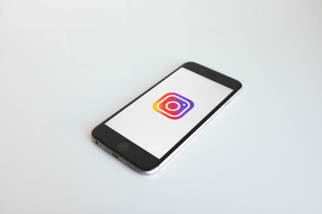
Most tech companies and social media sites usually have blue on their logos. Instagram used to have a touch of blue before its 2016 makeover too. Do you remember the vintage Polaroid-like camera? We do too.
Their gradient shift placed them ahead of the curve by being two years ahead of the gradient resurgence. By adopting a more colorful approach, Instagram has set itself apart from other photo-sharing social media platforms.
2. Starbucks

A Moby Dick character is the inspiration behind Starbucks’s logo. Since its inception in 1971, this iconic global coffee chain has seen its fair share of logo changes.
The logo’s first iteration still had the brand name attached to it. It wasn’t until 2011 that Starbucks decided to drop its name during its rebranding process. Since the company was already a household name at that point, it still maintained its recognizability.
3. Nike
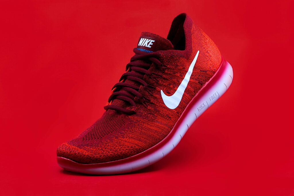
Whether geometric or abstracts, you can’t deny how powerful shapes can be in modern logo designs.
You don’t need to be a sneakerhead to recognize this iconic swoosh anywhere. It may be almost 50 years old, but Nike’s iconic logo has aged flawlessly through the years.
The swoosh usually stands alone in marketing campaigns; however, the company inserts the Futura Bold wordmark from time to time in some items.
4. Supreme
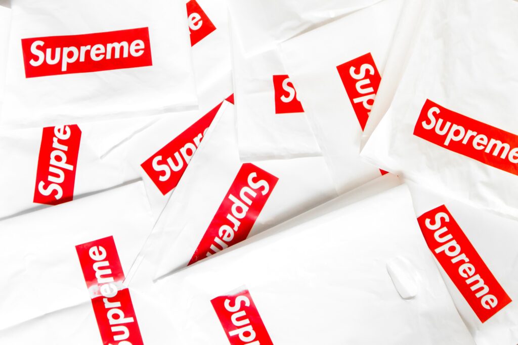
This streetwear brand isn’t just recognizable to skateboarding and hip-hop fans; most folks can recognize Supreme’s branding as well.
Although the brand is 27 years old, the logo still looks sharp and fresh thanks to the color scheme, framing, and text box.
How to Make Your Logo Modern

Having a modern logo is one thing. Designing one, however, is a different story. Don’t worry, though! If you’re a graphics rookie or simply undecided about your designs, we’ll show the ropes of making a modern logo design that fits your brand’s image.
1. Do An Identity Assessment
What is your brand all about? Figure its identity out before you start sketching your ideas. Ask yourself these questions as you do your assessment:
What gives us an edge above our competitors?
Why does our brand/business exist in the first place?
What matters to us as a brand?
Once you have a complete understanding of your message, designing becomes a less stressful process.
2. Get Inspired
Now’s the time to look for some ideas. Unfortunately, they don’t grow on trees. Inspiration can be challenging to find, especially if you’re experiencing a creative block.
Get your imagination working by brainstorming. It’s always good to let ideas out, even the bad ones. Put yourself in your target market’s shoes and think about how you want them to look at your brand. You can even use or create mood boards to visualize your ideas and work from there.
You can also take a few cues from some of the most influential brands and see how they did their logos. Check out the list above for some inspiration. Feel free to browse TemplateMonkey’s logo collection as well! We’re sure there’s something in store for you.
Recommended reading: Apple Branding: The History
3. Look At Your Competition
You may want to do your best Sherlock Holmes impersonation and do your homework on your competitors. Since you have the same target audience, you’ll know what clicks and what doesn’t.
When you get to the actual designing, set yourself apart from them to sell your uniqueness. Don’t be a copycat (and make yourself vulnerable to lawsuits at the same time!).
4. Choose Your Type
Since you’re set on a modern logo designs, select a logotype that fits your brand’s aesthetics. These are types that you’ll be picking out from:
Lettermarks
If you want a streamlined look, letters are your best option. This type is especially great for companies with lengthy names.
Wordmarks
If you’ve got a catchy name, why not take advantage of that? Wordmarks are a bold and straightforward declaration of your presence. Feel free to go for bold colors to make it pop.
Symbols
This type usually pops up whenever we think of logos. Pictorial marks consist of icons or graphics, making them quickly identifiable to customers and clients.
Abstract
This type can be a little tricky to pull off. Going by its name, logos of this variant don’t have established geometric forms. Don’t be discouraged, though. Use its nature to your advantage to make your logo unique!
Mascots

Inject some fun by using illustrated characters! You can always count on mascots to liven up an atmosphere. It also gives your brand a friendly image too.
Combination Marks
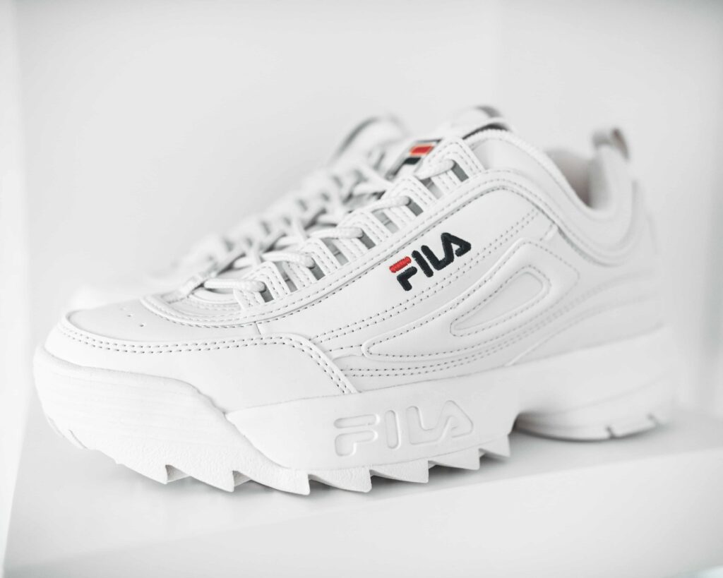
The more, the merrier, right? This logotype brings the best of symbols and wordmarks together. It also has an added advantage: you can use one or both elements together, depending on your needs. Either way, you’ll see some recognition coming your way.
Emblems
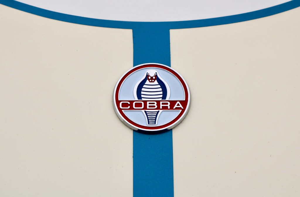
This last type sees fonts housed within a symbol or icon. Companies who use this type tend to design them in traditional styles, although some have managed to update this to a more contemporary look.
5. Pay Attention To Your Colors And Fonts
Colors are associated with various feelings and ideas. Read up on color theory to look upon their meanings. If you’re going to use multiple tones, make sure they don’t clash! You wouldn’t want a mish-mash, do you?
Since you’re designing a modern logo, be mindful of your typography as well. The best practice is to use sans serif fonts since they have a contemporary look.
6. Communicate And Evaluate
You and your designer should have an open communication channel. If you can, provide a design brief to give them a head’s up on what you want. Be a listening ear to their suggestions as well! Remember, feedback is a two-way street.
Current Logo Trends
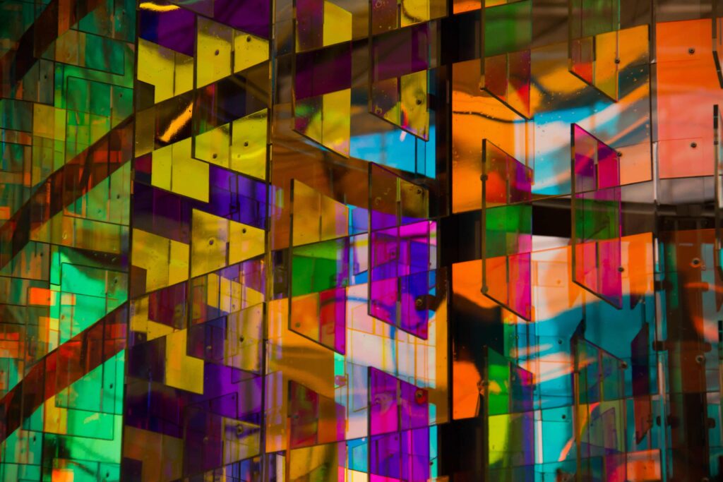
Another year means that another set of trends come and influence today’s designs. Let’s look at some of these trends, shall we? You may gain some inspiration as you design your logo.
1. Stained glass
You’d usually see stained glass pieces in churches. This classic has now made its way to graphic designs. Designers add a fresh spin to this ancient art form by combining it with abstract shapes.
2. Simple geometry
There’s magic in simple shapes. The restrained nature of simple lines and shapes allows designers to be a little more experimental with other elements like colors. If you’re up to the challenge, you can even layer these shapes to create depth and structure.
3. Analogous colors
Analogous color schemes aren’t new, but they’re making a comeback in 2021. Don’t mistake this trend for a boring one. This balanced approach is the total opposite of contrast; since we came off a crazy year, we could all use a bit of harmony.
Bust out your color wheel and see which tones are adjacent to each other. You’ll be surprised at the results.
4. Authentic portraits
Most people crave authenticity. The more genuine your brand is, the more likely will your base stick around. Portraits tell stories that people can relate and connect to. They range from flat drawings to detailed illustrations.
5. Static motion
How can one add motion to something motionless? Innovative designs will do the trick. Challenge yourself by using effects like splatter particles and action lines to give your logos life.
Hopefully, you’ve learned a thing or two about modern logo design. If you want to create one for yourself but don’t have the time to start from scratch, we have the solution for you! TemplateMonkey has a diverse array of modern logos that cater to different industries. Sign up now and start designing!

