Every bit of marketing tools and strategy plays a vital role in your overall plan for marketing. When you’re giving out business cards or brochures to potential customers, keep in mind that it will always leave an impression on how they perceive your organization. In this age of cyber technology, the purpose of brochure design is frequently disregarded and overlooked. According to some people, it’s viewed as old-fashioned as in an age dominated by social media marketing. However, brochures are a compelling marketing material, as long as they’re well-crafted to draw in potential customers.
If you would like to ensure your brochure design captivates more attention from potential customers, well, we’ve got something for you. We have constructed a progression of tips to advance your brochure designs from great to outstanding!
But before anything else, let’s learn the basics first!
Why Are Brochure Designs Important?
Crafting a brochure is easy-peasy. However, designing a brochure that your potential customer will save for later usage is not a simple accomplishment. A brochure with an efficient design is essential in making one with items and service descriptions conveniently presented.
Recommended reading: How to Choose the Right Business Name
Creative Tips for Brochure Designs
Listed below are 15 things that you need to consider for impressive brochure designs, along with editable brochure templates that you can use!
1. Identify your objective
Likewise, with all planning, the initial step is to distinguish your brochure’s purpose. This will dictate everything from who your target market is to what brochure template is right for you.
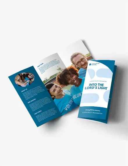
Check out this Charity Organization Brochure that is uniquely crafted with blue and white as its primary theme for professional brochure designs. The photos of volunteers and your advocacy make for a unique look that highlights the pages and enhances the brand’s purpose. Get this today!
2. Brochure folds are important
One of the distinctive highlights of a brochure is its various folds. Indeed, these folds control how your item and service description is introduced to your potential customers. Picking the correct fold for your brochure is formidable. You need the fold to match the kind of content you incorporate in the brochure and how your potential customers understand it.
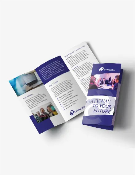
This modern Advertising Agency Brochure template is crafted to make an expert business statement about your trademark. With a midnight blue theme along with its three-folds, the brochure allows you to market yourself as a steady, dependable brand. Download this today!
3. Review your content from a customer’s viewpoint
Assess your content with high regard to your potential customers and how it identifies with the entire visual plan. Make it enticing as not to overwhelm these potential customers.
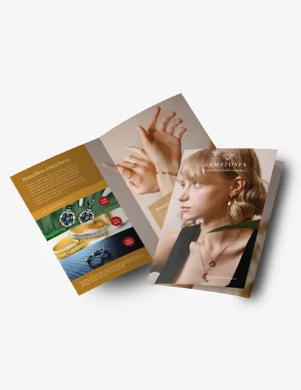
You may check out this two-fold Elegant Jewelry Brochure template, specially crafted for modern jewelry brands with huge segments for photographs and information to captivate potential customers. On the primary page, incorporate your business logo at the upper right corner along with your business name so that people don’t overlook it as they read through your brochure. Make this yours now!
4. Decide what fonts to use
The brochure content is normally illustrated with a heading, a subheading, and the body of the actual content. You should remember this while picking the text styles that you will use for your brochure.
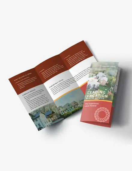
Take a look at this Homey Vacation Rental Brochure designed for rental properties utilizing warm tones that portray a cozy home. The utilization of void areas and elegant non-cursive text styles adjust the entire picture. This template additionally has a space to change and utilize photographs of your properties. Get it now!
5. Consider your coating and paper stock
Though it may seem tedious, the kind of paper you choose and the finish of your brochure is an essential part of brochure design. Your decision of coating and paper stock will likewise impact the durability of your brochure.
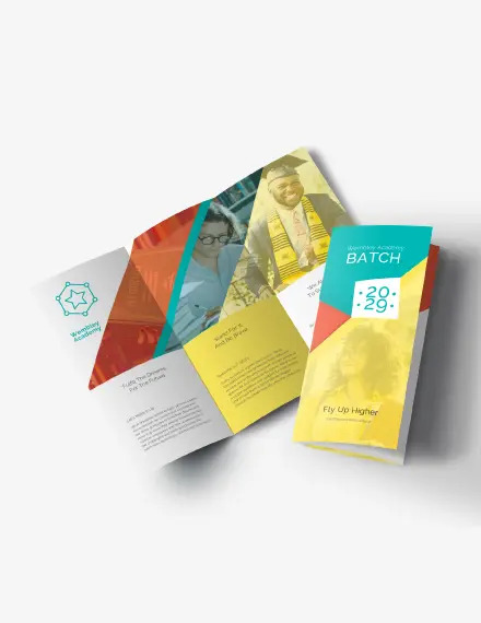
This educational brochure uses essential tones to make a natural shading theme matched by white spaces. Differentiating white and dark writings are utilized on dim and light foundations to guarantee that all information on the brochure is clear. Available for download now!
6. Utilize high-definition photos
Image quality plays a vital role in basic brochure designs and ensures that they are organized in an immediately engaging way.
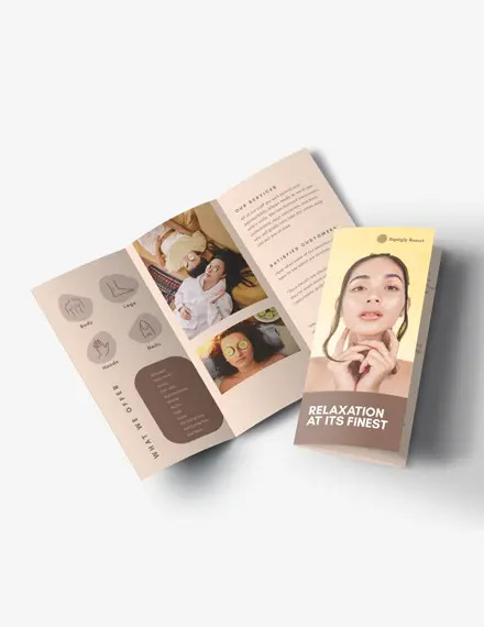
Check out this Warm Resort & Spa Brochure and captivate the eyes of potential customers who are stressed out at work. Delicate natural tones rule this brochure to make a warm and inviting design that clients will adore. The forefront of the brochure has an enormous section for your photograph to showcase your best-seller services. It has reader-friendly messages that permit you to incorporate numerous contents in its three-segment design. Get this today!
7. Incorporate a plan of action
This is the part where you lead your potential customers to an expected action. Regardless of whether it’s to purchase your items, visit your website, or take advantage of promotional discounts!
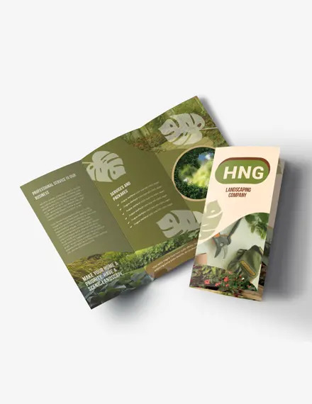
Take a look at this Landscaping Brochure template that allows you to notify potential and existing clients about your services. There’s a section to lay out the services that you offer to entice clients that will make them want to benefit from your skills. Download this today!
8. Find out who your target audience is
Before starting any marketing strategy, you should know who are your target customers as this would also affect the quality of your brochure designs!
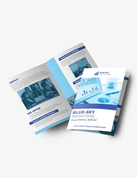
Have a look at this Blue Recruitment brochure specially designed for recruiting companies. This brochure layout gives you a blue shading accent that immediately makes individuals trust your services. Make it yours now!
9. Communicate through simple statements
Occasionally, the best ideas are the simple ones! Keep your content short and concise so that it’s easy for clients to read it.
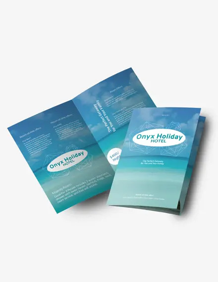
This Hotel and Resort brochure has an outstanding design with the beach as its background while the text overlays it beautifully. This will surely stand out to clients who want to get away for a short vacation! Additionally, the utilization of clean white content makes your business information simple to peruse. Get this right now!
10. Establish an outstanding first impression
Brochure designs need to complement what the customer does as a business. So it’s always good to craft a brochure that looks stunning on a lounge room stand.
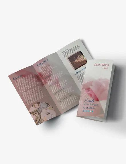
Use this charming brochure to showcase your exquisite organization, and it will help you boost brand awareness. This brochure template uses roses in the backdrop along with a pastel blend as a feature of its design that will undoubtedly make your intended audience take a second look. Available today!
11. Be open to creative figures and sizes
Brochure designs need to have its serious edge to get your clients’ eyes. One of the approaches to contend is to consider incorporating creative shapes and sizes.
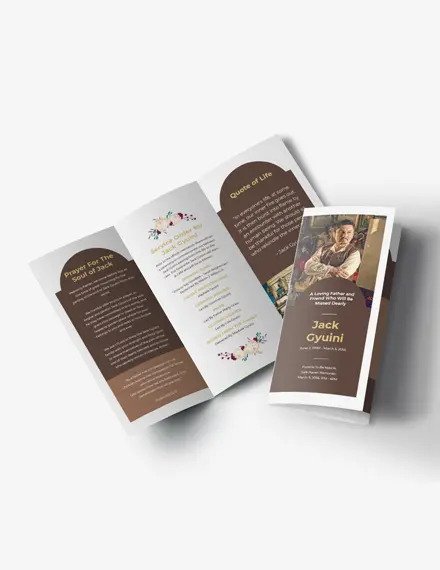
With this Vintage Funeral Brochure, you can honor a friend or family member’s existence by giving the people who loved and adored them this brochure. The design highlights a theme of brown accents and flowers, with a brown arch shape on most folds that outfits a formal yet classic vintage brochure. Download this today!
12. What’s in it for the customers?
Prospect customers are only interested in themselves, so you have to showcase the benefits of your service to them.
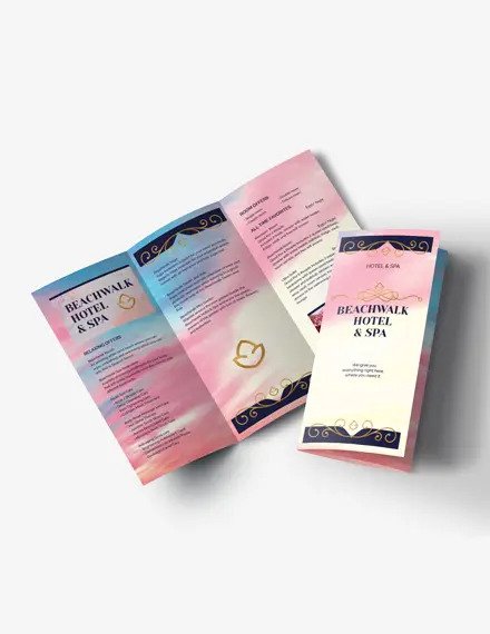
This brochure for your hotel and spa features a beautiful foundation with blue and pink shading colors that can charm any individual who will take a gander at it. Get this now!
13. Use captivating headlines
The normal peruser takes under 5 seconds to look at the front of a business brochure and choose whether or not to continue reading. So make sure your headline can draw in potential customers that can make them want your service.
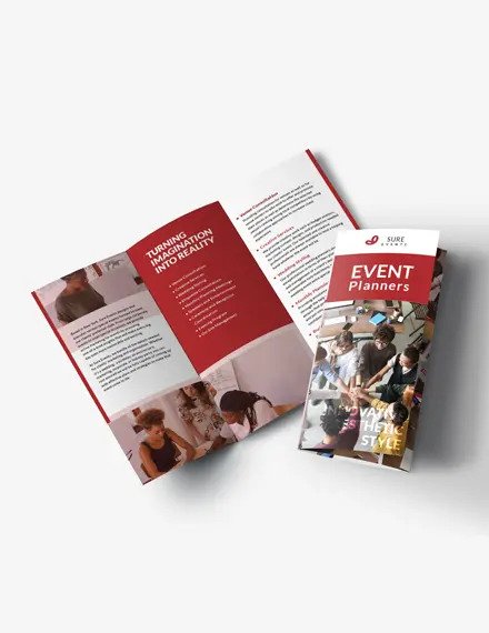
Check out this well-organized brochure with a red shading design with the ideal measure of room to showcase your headline and services. Make this yours today!
14. Make it look professional
The brochure must also be presentable and professional at the same time so that the brochure will engage potential clients to check out your services. Professionalism is essential when representing your brand.
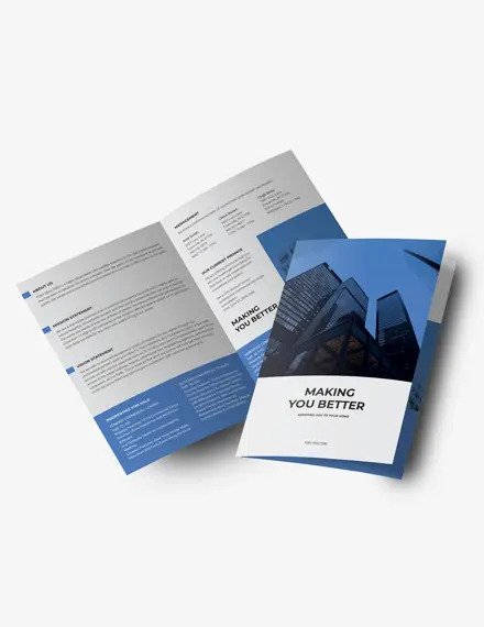
This brochure shows an orderly structure and basic typeface to introduce an easy-to-read marketing document. Additionally, it looks slick with a blue and white shading plan. Get this today!
15. Choose essential colors
Your selection of colors extensively affects your customers’ underlying insight about your organization, so make sure to choose a color that represents your brand.
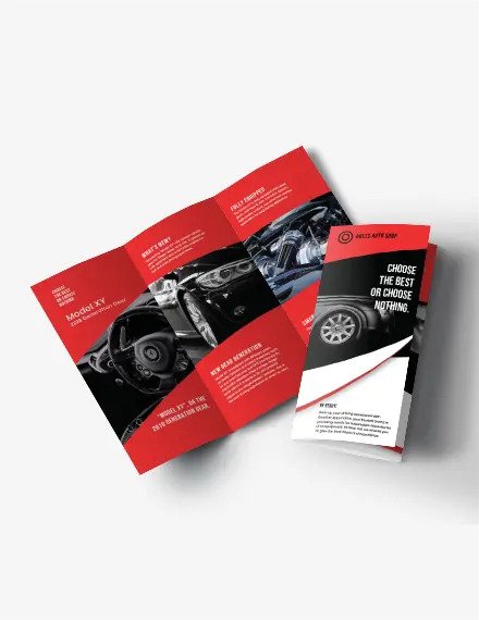
Catch a glimpse of this Auto Repair Shop brochure that has a blend of white and distinctive red tints and a modern design with lines and areas that defines all your organization’s information creatively. Download now!
Browse For More
For more stunning and beautiful editable templates for your business, check out TemplateMonkey today and get a hold of those charming brochures!


