The food service industry is one of the most competitive there is, with big and small brands vying for the public’s continued support. To succeed in such a competitive landscape, entrepreneurs must do whatever it takes to stand out in a good way.
Now, most people will automatically think of offering quality dishes made from the finest ingredients. There’s nothing wrong with doing so as good food is the industry’s lifeblood, but some matters need settling before we enter the kitchen.
Let’s talk about branding components—specifically, the menu and its design.
Every component plays a specific role in our branding and marketing strategies. In this case, the menu is closely associated with our restaurant quality considering it’s the material that presents our offerings. Moreover, it’s similar to the logo in that customers will always come across the menu in their time patronizing our restaurants.
That said, small and big restaurants alike can’t afford to have a poorly designed menu given its importance to the business. If this is your first rodeo, there is no need to fret as we’ll first cover what makes an effective menu before diving into aesthetics.
Avoiding Half-Baked Menus
Planning a menu is made easy if one treats it as the appetizer to the full restaurant experience. The mindset can lead to the creation of menu designs that fill customers with visuals and information without being too overwhelming.
For a more on how to do that, follow the steps below:
1. Limit the choices
The process of ordering food can be stressful at times. After all, customers have much to consider, from their food preference and allergies to their budget. Offering too many items per category may result in customers defaulting to what they’re used to. If we want them to try something new like one of your house specialties (and something a little pricier), having seven or fewer items per meal category is needed.
2. Be descriptive
Menus often come with food descriptions as they serve as preludes to each dish. They should be truthful and straight to the point, all while highlighting the dish’s best points. Pro Tip: Using sensory words such as “fiery” or “crispy” can help restaurateurs craft more enticing food descriptions. It’s also worth noting that customers want to know from the food description what it looks like and how it tastes.
3. Keep things short
This especially applies to meal descriptions. Guests are hungry when they come in, and they wouldn’t appreciate having to comb through a novel-like menu.
4. Section the design
On the same note, dividing the menu into categories makes it easy to peruse. The standard division goes Appetizer, Main Dishes, Desserts, and Drinks, but restaurateurs are free to be as creative as they like so long as the division is logical.
5. Use photos sparingly
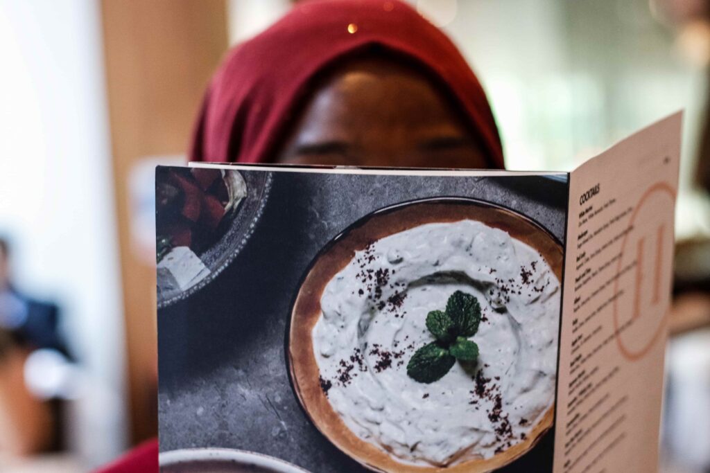
Studies have found that inserting pictures into menus can be a hit or miss. It entirely depends on the dish and its name. For example, dishes like fish and chips or spaghetti and meatballs will greatly benefit from photos as their simplicity can be easily captured in photos. On the other hand, accompanying unique items like “Chocolate Oblivion Cake” with photos may cause more confusion than necessary. It’s best to leave the job to the description in this case. We should also remember that our businesses should own any photo we use in menus.
6. Place the price
But we shouldn’t be careless in doing so. Emphasizing the price point too much can lead to customers shying away from more expensive choices. One thing we can do is omit the currency symbol (12.00 vs. $12.00) or write the prices out (twelve dollars). An expert has found that prices ending in decimals, particularly “.99,” are more likely to attract customers as the price point signifies a deal is made upon choosing the item.
7. Forget the “Sweet Spot”
For the longest time, the industry believed that customers follow a specific pattern when browsing menus, beginning in the right-hand page’s midline, or what is commonly known as the “Sweet Spot.” This has resulted in countless restaurants placing their best item in said spot. Recent studies, however, have debunked this belief, indicating that customers actually go through the menu sequentially. While it’s okay to follow this system still, it doesn’t guarantee any changes in sales.
Having gone through these items, we can then move on to the more exciting part—designing the menu. There are several ways to go about this; the most popular is hiring a professional designer to bring our visions to life. But, let’s take a step back from the conventional for a moment and consider an option that isn’t only good for aesthetics but budget as well: Menu Templates.
A Ready-Made Design Feast
The debate regarding templates versus custom-made designs has been around for quite some time. Naturally, more people gravitate towards the latter, seeing as custom menus assure uniqueness and brand accuracy.
But what if we were to tell you that templates can offer both characteristics? Every template online, especially those on TemplateMonkey, is crafted with customizability in mind. They come in multiple formats to ensure that clients will have no trouble making their chosen menu template theirs. Moreover, design quality is never compromised, both for premium and free menu templates, since expert designers are responsible for creating each template.
Another interesting factor is the price tag. Templates are much cheaper than the services of graphic designers. Should there come a time when we need to refresh our menu designs, no hesitation will arise if we use menu templates, thanks to their affordability.
That said, let’s explore some templates that make excellent launching pads for our menu designs.
Bright Burger Joint Menu
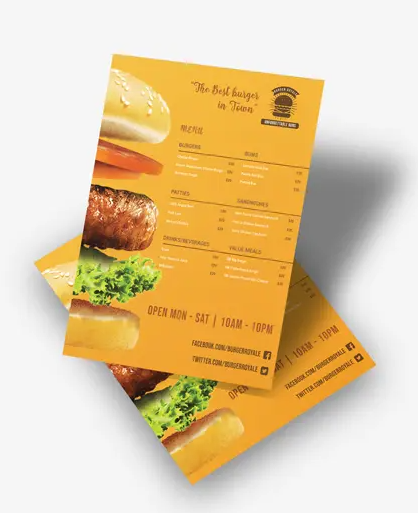
The Color Theory dictates that colors in the warmer spectrum, like yellow and orange, effectively stimulates the viewers’ appetites, making them excellent color palettes for menu designs. Restaurateurs operating a burger-centric establishment should then take advantage of this template’s intense yellow background. Working in tandem with the color is a scrumptious deconstructed burger that will surely have customers hungry to try out the menu. As a bonus, the menu template also comes with vast free space that makes organizing the menu easy.
Classy Italian Restaurant Menu
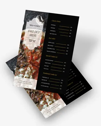
As previously mentioned, restaurants should feature photos sparingly as they can make establishments appear cheap when misused. If it can’t be helped, we should consider using one food that encompasses what the restaurant offers. For example, Italian cuisine is most known for either pizza or pasta. This free menu template takes advantage of that fact by offering a side panel to feature such a photo. Next to it is a plain space that makes it easy to highlight whatever font is used. The photo panel also comes with an elegant frame to place the restaurant’s name in.
Minimalist Restaurant Menu
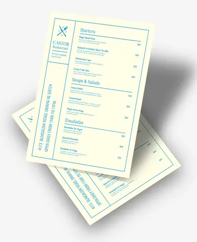
There are times when we should let the menu speak for itself. To do so, we’ll need a minimalist menu template like this one. It offers a straightforward layout and plain background. The frames dividing each section will make it easy for guests to peruse the menu. Meanwhile, the simple contrasting palette attracts attention without taking away from the menu content.
Classy Navy Restaurant Menu
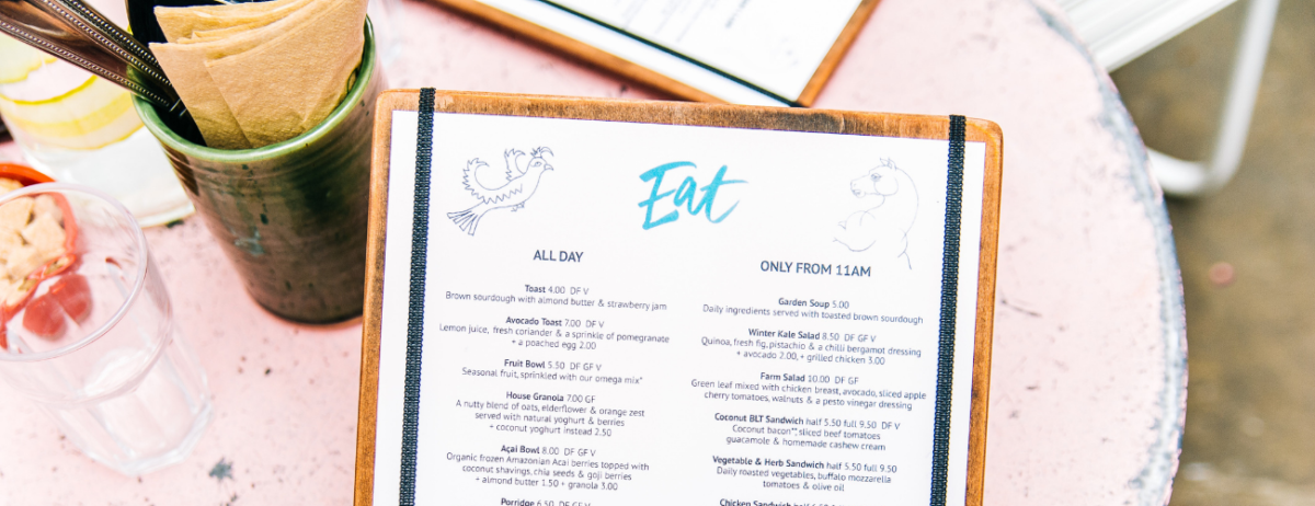
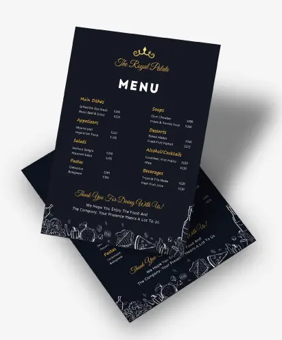
If we need an element to portray some of our dishes, we can always opt for illustrations as an alternative. Depending on the style, illustrations add depth to the menu design while also adhering to the brand style. Those who are looking for a classy design can turn to this menu template. The navy background makes the perfect base for the light hand-drawn illustrations. Combined, these elements create a look that will certainly appeal to a larger crowd.
Of course, there are many more where these templates came from. Some may even find the wide array of selections overwhelming to a certain degree.
To lessen your time spent searching for the perfect template, consider the following factors that affect menu design.
Brand restrictions
Menus are advertising tools, meaning that they need to represent our brands accurately in order to be effective. We can prevent any mishaps from happening by keeping in mind our brands’ aesthetics. When shopping, consider the colors our restaurants predominantly use. Noting our food specializations is helpful, too, especially if it’s cuisine-wise as there are templates created for Italian, Japanese, Chinese, and other themed restaurants.
Food offerings
It should go without saying, but we can’t shop for menu templates without completing our food and drink selection. It’s imperative to have an exact number in mind as the content will influence the sectioning, spacing, and even the template that we can use in the end.
Menu type
In direct relation to our food offerings is the kind of menu we should use to adequately advertise our restaurants. There are several to choose from, some of which we discuss below:
- A La Carte Menu. When translated from French, a la carte literally means “according to the card (menu).” This kind of menu doesn’t feature set meals and instead lists the items individually. Customers are given free rein to combine whichever items they’d like to have.
- Du Jour Menu. Commonly referred to as the “Daily Specials,” this kind of menu features soups or salads that change depending on the day, alongside a set food list.
- Static Menu. The static menu is the kind of menu we often encounter. It’s divided into categories, from appetizers to desserts, and typically offers the most choices among all the menu kinds.
The Threat of Overindulgence
Once we have gotten our affairs in order—from the aesthetics that fit our brands to the kind of menu we wish to feature in our restaurants—we can then shop for and personalize menu templates.
In this regard, we must bring up that the freedom to make each template our own can set us back if we aren’t too careful with how we insert our unique restaurant details. There’s a possibility to overfill templates to the point that they lose their magic.
To prevent such a thing from happening, we should handle templates as more than aesthetic tools. They are content guides as well. Every menu template, free or otherwise, comes with set information in the file. The details found on each menu have been carefully inserted by experts so that users have samples to follow, resulting in the retainment of the menu’s effectiveness.
Other than that, we’re free to do whatever we want to arrive at a design that will bolster our restaurants to stardom.

