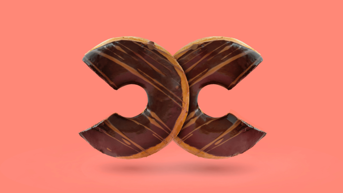
Logos are essential elements of a brand’s identity. They are a permanent (or semi-permanent) icon that represents the brand’s ideals with visuals. For this reason, logos are not necessarily things that change with trends. In fact, some brands have had the same logo for decades. However, as times are advancing, and user experience demands are shifting from what they used to be, most brands upgrade and adapt to logo design trends to fit the times. Same message, same identity, but a different aesthetic.
In this article, we’ll look into the latest logo design trends and how you can optimize them for your brand. We’ll also be touching on the importance of a logo to getting your brand the visibility you want.
Whether you’re just starting as a new brand or looking for an upgrade to an already existing logo or looking for inspiration to make a cool logo template online, here are new logo trends for 2020.
10 Logo Design Trends For 2020
1. Thin Lines
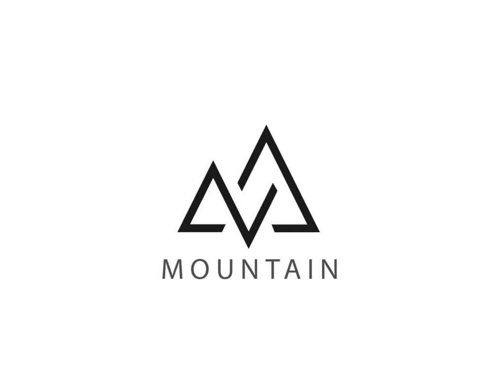
Minimalist logo designs are back in vogue, and designers are increasingly showing that less is more. It is a very stress-free design, ideally for businesses that want to concentrate on functionality and practicality.
Minimal designs include straight lines, smooth curves, circle forms, square patterns, and much more. In the end, they look effortless and straightforward, but a lot goes into achieving minimalist logo designs. These kinds of logos are difficult to pull off without the aid of a computer, because of the delicately thin lines. Logos with these styles can be hard to read on print. But as digital media continues to grow, there is an increasingly less need for print media.
Some brands are entirely based online and have no physical brand reach media, and these minimalist styles are popular among them. Many tech or industrial brands use this style.
2. 3D Gradients
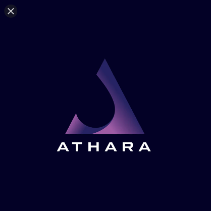
The 3D logo design trend has already rocked the design world, but in 2020 we’re incorporating that with gradients this year. Gradients are a perfect way to turn any collection of colors into a vibrant color spectrum and combined with a 3D design, and the result is a logo that looks as if it has life and energy.
The colors could be distinctly different, with the gradient effect tapering them into one another and highlighting contrast. They could be various shades of the same color merged into one beautiful, vibrant logo design.
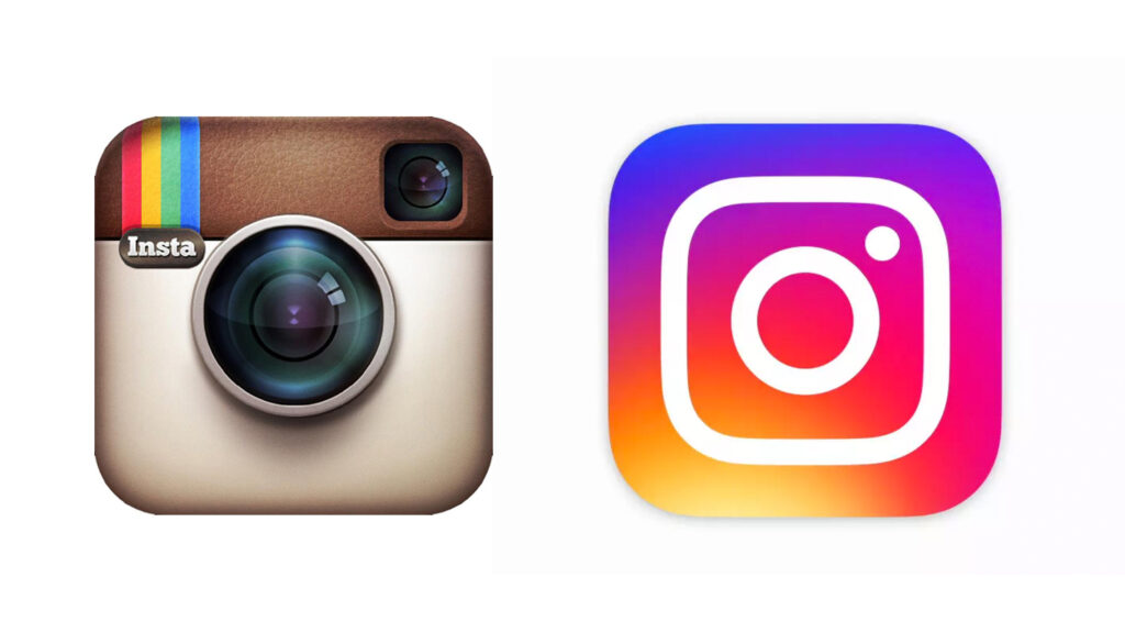
This combo can instantly turn a simple design into a modern, sophisticated logo design. However, like thin line logos, 3D gradient logos can be tough to pull off in print—they look a lot better online— so they’re great for brands that put little or no thought into their print media.
3. Retro/Vintage Designs
It’s ironic how the old design patterns have become new logo trends. The throwback culture is not only evident in fashion and music, but also in design. In 2020, 80s-inspired designs with plenty of chrome, neon, and pixel details are circling back and becoming cool again. Heavy lettering, rugged colors are showing up more frequently in today’s designs, and the results are logos that evoke nostalgia and look really fun.
New businesses can adopt the vintage logo concepts to make their brand look like it’s been around for decades, as this can help create a feeling of familiarity and build trust with their customers. Get the retro look from our collection of vintage logo templates.
4. Hand-drawn Logos
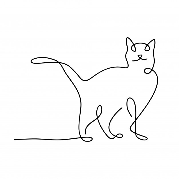
Digital perfection has become so much of a norm that designers are now ditching clean lines and perfect edges for the rustic, original look of a sketched logo.
Asymmetry, irregular lines, and shading techniques such as cross-hatching and shading of contours are some of the design elements that are becoming increasingly popular and endearing to many audiences.
Brands can show off their authenticity with the hand-drawn look and give their logos the personality their consumers want to see. It’s a perfect look for businesses that provide natural, organic products (which are also becoming the rave of the new 21st century).
5. Animated Graphics
Know what’s better than a static logo? Animated logos! With the webspace becoming more and more saturated, it can be hard to stand out with a regular logo, so many brands turn in the direction of motion graphics.
Whether it’s breaking down the colors of your logo and getting them to rearrange in a cool pattern, or using an animated cartoon as a focal part of your logo, motion graphics are a sure way to capture attention for longer than a static logo would. The more creative you get with the animation, the better your chances of staying in people’s subconscious and getting more recognition for your brand.
If your brand’s personality is more on the fun and interactive side, don’t be afraid to get playful with animated graphics! They would be perfect for adding an unforgettable touch to a gaming logo template, or even photography logo templates.
6. Mascot Logos
It is becoming increasingly popular for brands to use a mascot personality to represent the brand’s logo. Mascots are easy to relate with and create that person-to-person relationship that makes it easy to form a bond with a brand. Most times, these mascots could be bubbly animals like language app Duolingo’s owl, Duo.
Mascot logos are also easily recognized, and they are perfect for games and other interactive products brands. Mascot logos are taking over the design world because they give brands the personality their customers want to see.
7. Multilayered Logos
The new logo design trends are mainly designs that deviate from the flat logo trend that dominated the past decade.
In 2020, we’re seeing designers creating more nuanced logos that use highlights, shadows, and contrasting colors to reveal even more about their products with more layers to play with. Overlapping or multilayered logos create a depth effect that’s a lot more pleasing to the eye than regular, flat logos.
8. Bold Typography

Directly opposing the thin line logo trend is going all out and using bold typefaces to create a definite statement with a logo. This daring typography trend uses text only, without supporting images, and infuses as much personality as possible into the text.
The results may be weird, but so is every revolution from the norm at first. Think of it as typography that has its own mind. Instead of choosing from a list of the same old regular fonts according to the personality of a customer’s brand, logo designers produce styles radically different from any fonts we have seen before.
This logo trend would fit perfectly in industries where minimalism and elegance are celebrated. It would look right at home on a wedding logo template.
9. Creative Letters
Usually, logos carry hidden (or not so hidden) meaning in their designs. It’s an excellent way to create mystery around the brand, and invite people to decode those hidden meanings. These hidden clues reflect the brand’s most valuable ideals or the brand’s purpose itself. Designers use various techniques to make the logo convey the intended message while keeping things simple at the same time. The use of negative space techniques and symbols to replace parts of the letters is quite famous for designing creative letters.
Creative letter logos also give companies a more playful appearance that can humanize the company. When consumers figure out the puzzle, they will remember the brand logo for long.
10. Geometric Shapes
Simple logos can be instantly made sophisticated with the addition of basic geometric shapes. They can quickly and delicately be implemented in all kinds of brand identity materials without being a distraction. To make them more memorable, designers usually use a unique color code or color scheme and a black-and-white version.
Why is a Logo Important?
Why should you even care? Many businesses thrive without having so much as a website. So why should you put effort into carving out a distinctive brand for yourself?
Here’s why. Logos are the way businesses are recognized. They express what makes a brand and for whom it is. It is a powerful tool because it is usually so small, yet it has to reflect the purpose and passion of a brand. It also will have to work across all advertising or promotional mediums that the brand has.
Think about Nike’s swoosh and Apple’s half-bitten apple, or even McDonald’s mustard color M. In the end, they’re all just little icons, but think about the feeling you get when you see that apple on your smartphone, or the swoosh on your favorite pair of sneakers, or the M on a paper bag on the drive home.
In these instances, these logos are not just icons- they’re feelings. The promise of security and quality makes the iPhone stand out from other brands. And that’s probably why you use one. Same as how you got the Nike sneakers because you think they’re sturdy and cool. Have you seen sneakerheads bond over shoes? All it may take to bring two people together is their shared love for Nike shoes, which they identified with the swoosh.
In all these ways, a logo is a representation of a brand’s promise. When you take a look at an apple logo and think ‘that’s quality and class,’ that’s a promise delivered, and the logo helped do that.
Should I Change My Logo?
No, no, not at all. Like we mentioned earlier, the test of a great logo is actually in its longevity. That makes the work of the logo designer harder than it seems. Not only do they have to make the logo meaningful and aesthetic, but they also have to make it adaptable for various media- websites, print (which includes flyers, billboards, t-shirts, mugs, paper bags and so on), ensuring that the logo design can be visible on all platforms.
The art of logo design is continually evolving, but its core principles remain the same. A logo must represent a brand’s intent and personality. It has to be easily identifiable, and it has to be flexible enough to be scaled up or down in size. If the basics are nailed, design elements like color, form, and font are like icing on the cake.
What matters most is letting your brand personality shine through, and then adapting to logo design trends could just be a voluntary decision.

