Customers like the idea of saving money during a purchase. That’s one of the main reasons why vouchers remain one of the best ways to market a product, event, or service. Even small to medium business owners can benefit from learning how to make a voucher template.
However, voucher production can cost quite a hefty sum to maintain, especially for businesses that are just starting. To use your resources properly, you should make sure you’re creating and producing your vouchers efficiently.
If you continue reading on, we guarantee that this guide will help you do both. Let’s start with the former—creating your vouchers with as little cost as possible.
Use Cheaper Materials
The best way to start reducing costs is to start looking at your suppliers. Small businesses tend to take the first supplier they can find to launch their brand as soon as possible. As you continue finding customers and growing the company, don’t forget to reevaluate your suppliers and their prices in the process.
The lowest price isn’t always the best choice, though! If you cheap out with the materials, you might end up needing to spend more to fix the inevitable negative consequences. Try to find the right balance between cost and quality.
Optimize the Manufacturing Process
Voucher production involves many activities, from procuring the materials to distributing them to the customers. One factor that most small businesses tend to forget is their manufacturing efficiency. If there are many flaws in the process, it can incur small additional costs that will add up to quite a large sum.
Other things you should be careful of are rejects and defective products. The former ends up wasting your materials and resources, while the latter causes you to pay more to rework them for usage. If you notice any of these happening too often for your liking, then it might be time to find a new manufacturing partner.
Reuse (When You Can)
Companies use vouchers to promote special events involving their brand. However, no one said you should restrict them to that event. You can also use these items in many other ways. Companies can use them in sponsorship deals, which are among the most effective marketing forms.
If you’re planning to use event or product vouchers, you should consider making their usage period as long as possible. It can be indefinite, or at least as long as you think you will need to use them all up. That way, you can keep your inventory waste-free and your company costs at their lowest.
Design It Yourself
A well-designed voucher is essential if you want your brand to become memorable. That’s why some businesses decide to hire a professional that can create their coupons for them. However, high-quality voucher designs also come with high commission prices.
Commissioned designs need not become a necessary cost to pay, though. You have other alternatives to consider. For one, using voucher templates for your company might serve as a good, if not better, choice for you.
Making the Most of Templates
Templates have a reputation for being generic. However, that’s not always the case, as professionally designed templates are just as well-made as commissioned ones. As a plus, you’ll be able to modify voucher templates and personalize them to your liking.
If you want to make a voucher template into your own, you can easily do so by modifying it with your brand in mind. Here’s how you can get started.
Use A Logo
Besides the name, a logo is one of the best ways to represent your brand. If you include it in your vouchers, its recipients are more likely to remember who they got it from. It’s an effective form of marketing—one that doesn’t require additional resources to do.
However, some businesses might not have the time and resources to create their logo. You won’t need to worry if that’s the case for you. Your brand name can also serve as the foundation of your logo. Voucher templates with unique typefaces are the perfect way to try this idea.
Recommended Reading: Tips for Creating A Vintage Logo Design In 2021
Use Unique Fonts
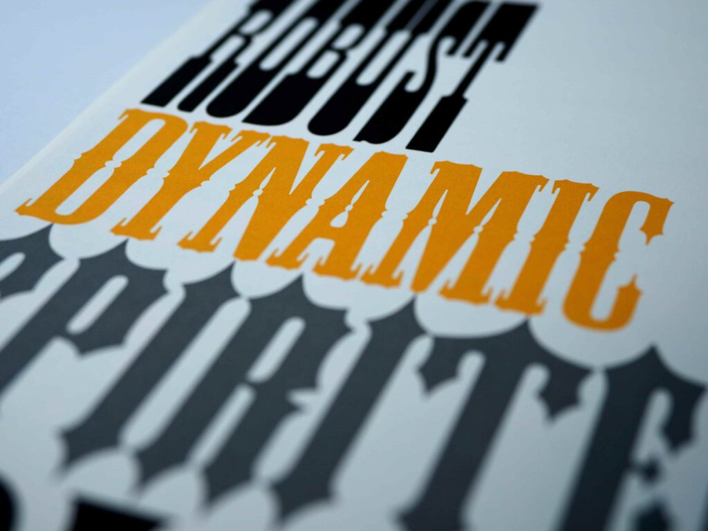
Choosing the right typeface is vital in calling attention to a voucher’s essential details. However, it also does more than that. Unique font choices serve to give customers a glimpse of your brand’s personality and style.
Serif fonts give off a sense of formality, perfect for businesses that want to give off a strong impression. For a more lighthearted feeling, sans serif and rounded fonts might be what you’re looking for. Feel free to mix and match fonts from various families so that you can create a voucher that perfectly represents your business.
Another tip you might want to consider is using your handwriting as one of your voucher fonts. You can accomplish it easily with font creating websites around the internet. There’s no better way to make your vouchers stand out than with your personal touch.
Add Images
Using striking graphics and images is another way to leave a memorable impression on people who receive your vouchers. It usually serves as the focal point of the design. There are many images you can use as an element of your voucher. Logos, as we’ve mentioned before, are one of them.
However, your choices aren’t limited to just that. For promotional events, you can use pictures related to your event. Voucher images can include a photo of the product or service you’re promoting or even a creative artwork that depicts what will happen in the event.
If you have the resources to do so, we recommend taking photographs of your own. It allows you to further fit your image according to the voucher’s theme. No need to waste time looking for pictures on the web!
Change Its Physical Aspects
To truly make a voucher template your own, one needs to think outside of the box. (Or paper, in this case.) If you have more room in your budget, you might want to consider altering your voucher’s physical factors.
You can start with the material you use for your paper. Using glossy paper gives image vouchers a bit of flair, while textured paper provides a new layer of perception. Try experimenting with various samples to see which material will best suit your voucher.
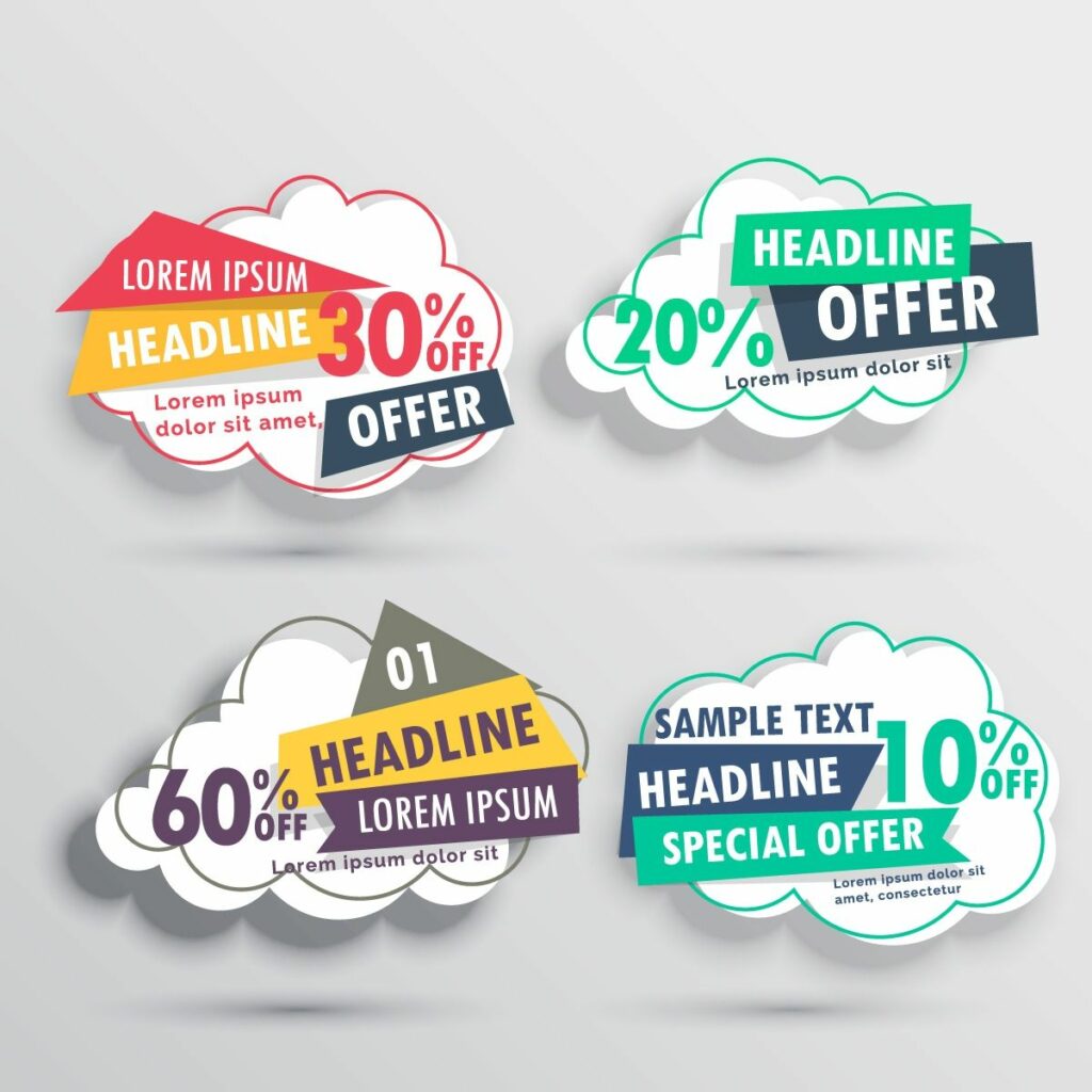
You can also cut your voucher into unique shapes. Onlookers and passersby will have a better idea about your event at just a glance. However, be prepared. Vouchers with intricate shapes will cost more to make. Ensure that you’re financially stable first before you start to invest in these processes.
Learn New Design Skills
Your voucher template is restricted only by what you know about design. If you start learning new techniques, ideas, and skills, you’ll be able to visualize better the design concepts you have in mind.
There’s no need to force yourself to learn new techniques continuously, though! Make a voucher template based on what you’re sure you’ll be satisfied with, instead of focusing on whether it will be able to attract your audience.
Pro Design Tips to Improve Your Voucher Templates
If you’re new to design, you might not know how you can begin learning more about it. Fortunately, it’s not that difficult. These are some of the tips both newbies and veterans to design frequently use.
1. Use A Grid
Making an excellent voucher template design relies on finding the right balance between all the elements you’ve used. Some people decide to play it by ear, but that won’t always work out for the best. That’s why you should use a grid while you’re modifying your design.
Using a grid can help you identify which parts of the layout contain too many or too few elements. However, your editing software might not have such a display option available.
If you’re using Adobe Photoshop, Adobe Illustrator, or MS Word to edit your template, you’re in luck — these applications provide a grid view for your canvas if needed. You might be able to find it in the View tab or menu of your software.
2. Rule of Thirds
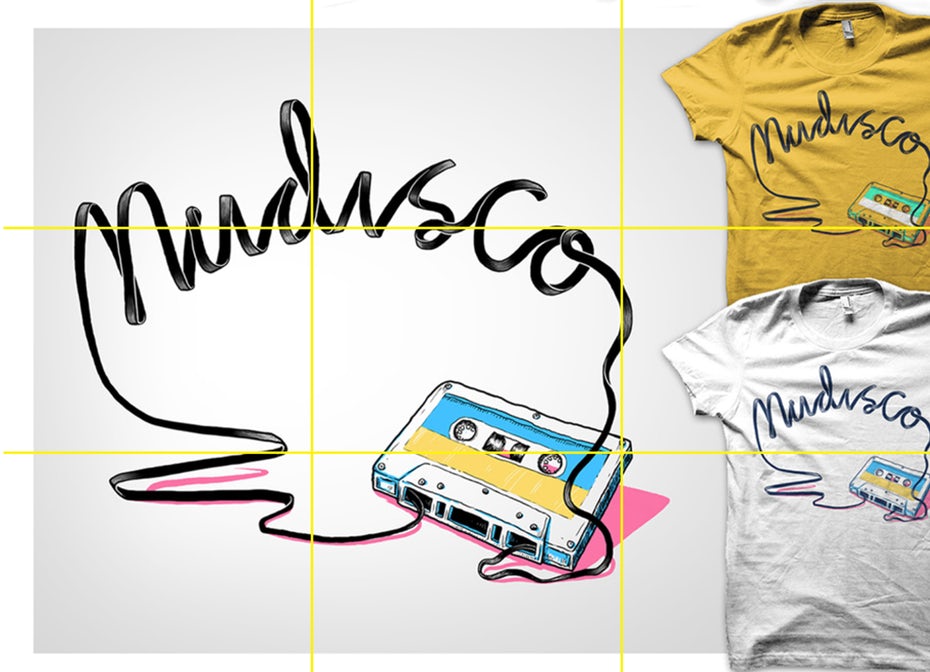
With grids, one is usually inclined to make their design symmetrical. However, that’s not always easy to do for all templates. If that’s the case for you, you should use what designers like to call the Rule of Thirds.
The Rules of Thirds say that you should divide your canvas into three rows or columns. It’s perfect for you if you’re having trouble balancing your designs. As a plus, you’ll be able to emphasize some aspects of the template if you arrange it right.
3. Negative Space
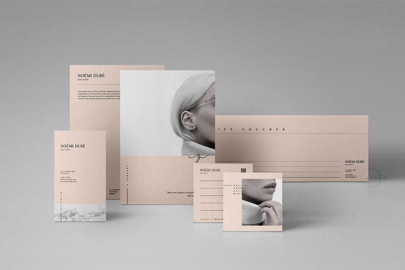
Novice designers are used to filling in one’s designs with various elements. However, you might want to consider your template’s negative space if you wish to have an unconventional template. The negative space refers to areas between the subject and the image.
Avoid filling your template with too many elements. It can make the voucher look cluttered and overwhelming. If you want to emphasize a particular part of your voucher, make sure that there is enough negative space around it to make it more noticeable.
One of the concepts that make full use of negative space is minimalism. It declutters the design entirely and includes only the most relevant design elements. You might want to use this technique if you wish your voucher has a cleaner look.
With these design tips, you should hopefully have a better idea of what to do while making your voucher template. However, this doesn’t mean that the design you create will be perfect. Let’s face it — not everyone has the eye and skill for design.
As you grow and work on improving your design, however, you’ll also be able to develop a style of your own. If you stay patient and hardworking, your efforts will eventually be rewarded with a design that you’ll be proud to call your own.


