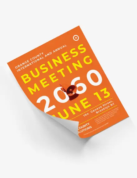
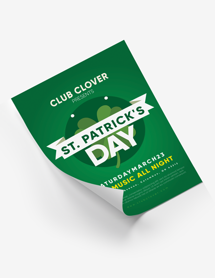
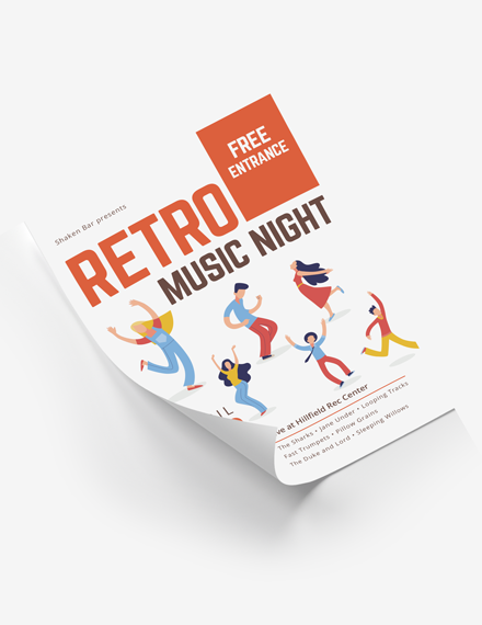
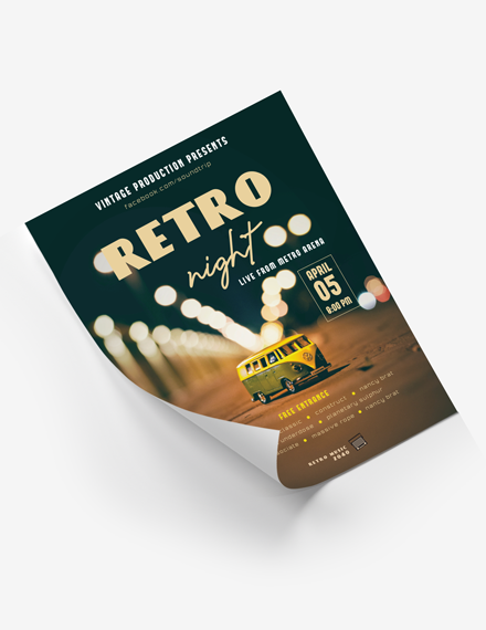
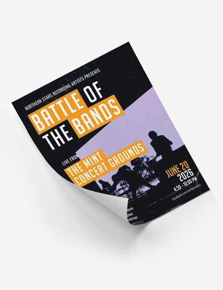
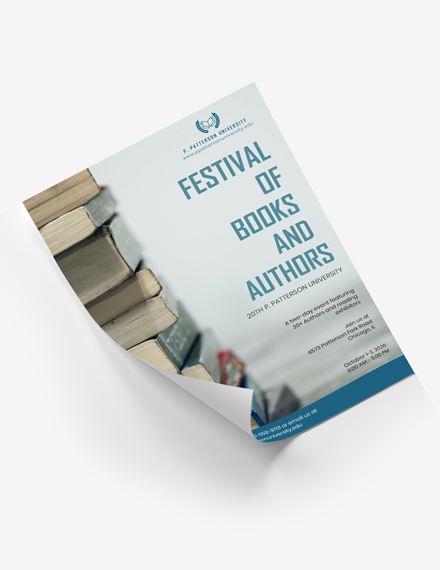
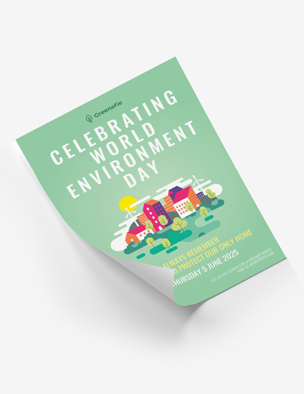
An event poster is an effective way to attract attention to your promotions, events, fundraisers, and other activities.
Posters are also a budget-friendly way to advertise a business, whether printed or posted digitally on social media platforms. Many businesses start a poster campaign to promote their newly launched goods or services, and they often use a poster for advertising some tempting price reductions.
Although there is no one-size-fits-all approach to creating an event poster, certain guidelines still dictate where a poster will be effective or not. Size is one of the most critical aspects of their design, and our poster templates are available in a wide range of sizes. However, letter sizes of 8.5 by 11 inches and 11 by 17 inches, and 22 inches by 34 inches are popular choices. There are also larger sizes available, such as 24 by 36 inches. Posters are usually made vertically, but they may also be made horizontally.
We’ve got you covered if you are looking for ideas about how to make your event poster stand out. You can use these poster design ideas for almost any event. So let’s get started!
Your Poster Should Be Easy to Read Even From Afar
Because of their massive size, people can see posters from quite a distance. However, the details they express should likewise be readable from afar. People are not interested in coming up close to a poster for them to read it.
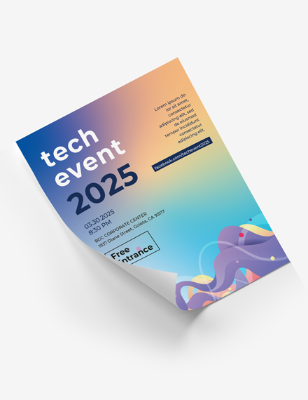
Three distinct layers of text are shown in an event poster template. A bold headline appears at the top of the page, and because of the bigger fonts, it is understandable from a distance. Choose a typeface that is readable but still engaging enough to catch the eye.
The descriptions are the second level of content. Give the most important details as well as the message of your poster. However, provide these descriptions in a font size half the size of the top headline.
Toss In Some Contrast To Help The Design Stand Out
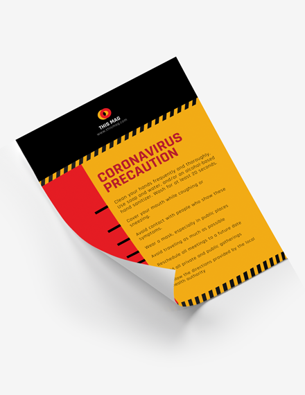
With a poster, you just have one chance to catch someone’s attention. High contrast among elements will assist you in accomplishing this. Go bold with color and type choices instead of sticking to a monotone color scheme of pale gradients. Event poster designs are an excellent opportunity to experiment with a typeface or color scheme that would otherwise be considered too “crazy” for other activities. Play around with it.
Consider a backdrop with a lot of colors. Many times, poster artists begin with a blank slate. To make your poster attract attention from the crowd, use a high-contrast backdrop with a perfect burst if your printer allows it.
Recommended reading: How to Create Your First Marketing Plan
Think About The Location
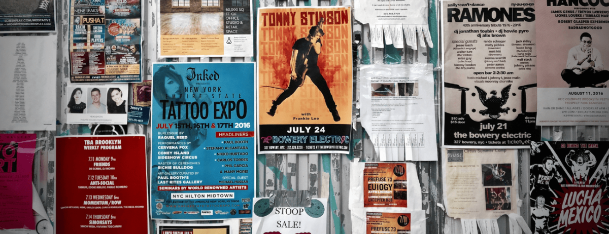
This is crucial: Where will your poster be displayed? This is influenced by several factors, including the poster’s size (and likely aspect ratio), visual clutter surrounding the poster, and whether or not the people who see it would recognize the call to action.
Knowing where you plan to hang the final design will help you make decisions on how to create it. Visual contrast is relevant not only within your layout but also as an external factor. Consider this: If you are going to put your poster on a green wall, you’ll probably want to use a contrasting color palette to avoid the logo blending in with the green wall.
Create A Mini Version Of The Design
Though poster design is generally a print project, make miniature versions that can be used elsewhere. Remember one of the basic marketing core values: an individual should be presented with something multiple times before remembering it. The various poster versions will assist you in achieving this goal.
Here are some tips:
- Reduce the size of a picture so that you can post it on social media platforms
- Create a postcard or a letter-sized flyer to distribute
- Think about making a “poster-version” landing page for your site
- Make a version that you can email
Utilize A Single Large Visual
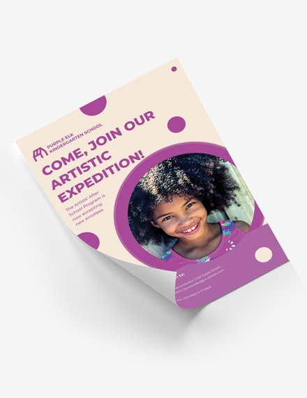
Whether it’s a picture, illustration, or text, a dominant image is essential to a poster design. This, too, needs to be prominent from a distance, much like the text.
When designing event posters, think deep—closer crops of faces or objects, single component illustrations, a typical scene with a sharp central focus, creative typography with high interest. After you’ve chosen a visual, be cautious when layering objects. Variety and photographs must have sufficient contrast to be readable on their own.
Make Use Of Space
Exaggerated spacing between components is a good idea for posters. The extra spacing can seem strange at first, but it will significantly increase visual effect and readability at a distance.
There are a few areas in poster design where having more room will help:
- In between each letter. At a distance, tight character spacing can allow letters to blur.
- Between text lines
- Surrounding the canvas’s inner edges
- Between different types of components, such as pictures and texts
- Around the design’s most critical aspect. What do you need clients to see first?
Incorporate A Call Of Action In The Design
Every poster has the aim of bringing attention to something. The majority of these “touches” include inviting people to an event, such as a concert, movie, or other activity. As a result, a call to action is essential. Consider it in the same way as you would a call to action on a site or app: give it a significant position in the design.
Although on websites, the call to action may not be as simple. “Sign up” or “email us” are standards on websites that you won’t see on a poster. In an event poster design, the call to action is often the event information or a contact point. When you understand what clients should do when they see the poster, that will help you create a perfect CTA.
Tip: QR codes, for example, are standard among some designers to allow users to scan for details; however, only use this method if it is easily usable for your purposes.
Let Your Event Poster Stand Out With Typography
Poster design is one of those areas where you can really let your imagination run wild with gorgeous typography. Without photographs or drawings, some of the best posters are crafted entirely of color and texture.
Remember similar typography ideas as you would with any other activities; presently, it isn’t an ideal opportunity to utilize ten similar textual styles in a single spot. Experiment with bolder, more extensive, and bigger typefaces.
With these types of choices, you can set the stage for the project. Use type that expresses the right mindset for the occasion. This can seem complicated at first, but it can be a very energizing exercise.
Make Use Of A Unique Printing Method
You can use a unique printing technique depending on the location and target audience for your event poster. On paper, you can do a lot of stuff that you can’t do in digital projects. This might be the ideal time to experiment with screen printing, foiling, letterpress, or the use of a UV layer.
Many of these approaches are typically reserved for more significant projects or activities of a certain caliber. Before deciding on a special technique, check with your printer to ensure that they can produce the prints at the scale you want. There may also be financial considerations when it comes to printing techniques. Some printing processes are expensive, so ensure you have enough leeway room before you begin.
Enjoy Creating Your Event Poster
Designers can have a great time when it comes to designing an event poster. While there are many things to think about and take into account, this is one area where you can ignore the rules and let your imagination run wild. The beauty of poster design is always an afterthought in an era where so much design talk revolves around websites and apps. Poster design can be a lot of fun and allows you to flex your creative muscles.
Posters can be used for almost any project in a number of ways. If you are not much of a designer yourself, you don’t have to worry! With the help of TemplateMonkey, customizable and ready-event posters are accessible for you to use at any time!
What are you waiting for? Take the chance to do something you’ve always loved to do or learn a new technique or ability. Use your creativity to come up with something different and exciting. A poster aims to attract attention from afar; be imaginative!

