The business world has progressed with time, and so, too, have the marketing tools we use to develop and advertise our respective business brands. But one thing that hasn’t changed is the importance of a modern brochure.
This progression has led many to believe that tools of the past should stay in the past since there’s no possible way that traditional marketing tools can stand against digital ones. However, some in our repertoire have aged gracefully and can even match well against digital devices. One such example is modern brochure designs.
The Need for Brochures in the Digital Marketing Age
Those who are new to the field might struggle to see the advantages of using brochures for promotions, especially if we take stock of the many digital marketing tools we can use instead. Here are some other reasons why modern brochure designs are beneficial for businesses:
1. All about sticking to the budget
Every business starts small, often with very tight budgets. Still, these businesses will need to work with any means available to advertise their brands to the public so that, in due time, they’ll experience growth. Modern brochure designs are prime examples of said means that won’t break the bank.
Companies only have to acquire a set of final designs before printing numerous copies of said designs and distributing them. This printing method is significantly cheaper than newspaper or magazine ads considering companies can continually print brochures from one design and get discounts when bulk printing. Plus, they’re not limited to a specific time period.
2. Portable, convenient, easy
Besides being the economical choice, modern brochure designs also present a more extensive reach than its fellow print marketing tools. Companies have the option to distribute them to any location based on their chosen demographic. People get pulled in by the designs, pick up the brochures, and easily cart them around thanks to the manageable size. This progression also raises the chances of others seeing the brochures and having their interests piqued.
3. Reaching your target market
People like to know what they’re getting into before making any decision, big or small, and the brochure is the ideal document to use in influencing said decisions. Unlike other advertising tools that bring together different brands, products, or services together, brochures are more focused in terms of the content they present to the reader.
Informing our chosen demographic about a particular topic is made easy by modern brochure designs. They’re pocketable, readable, and highly accessible for all age demographics, unlike emails or website content. They also make it possible to connect with existing and potential new clients.
4. Show off who you are
Brochures are essentially blank canvases that give owners the ability to tailor the final product however they want, down to the minor details. In short, we have free rein from the size and folds to content and design, even the printing material.
Another interesting facet about brochures is that they are creator-friendly regardless of a person’s background in design. Experts can easily craft brochures from scratch with their skills, expertise, and design programs. Meanwhile, amateurs can adapt modern brochure templates to arrive at designs that suit their brands best.
Recommended reading: 15 Tips to Improve Your Brochure Design
Your Shopping List for Brochure Designs
Understanding the benefits that modern brochure designs often leads to business people wanting to experience said benefits for themselves. As previously mentioned, individuals on a restrictive budget and have no design experience can use design templates as a launching pad for their brochures.
Here at TemplateMonkey, we offer a wide array of brochure template designs, with each one featuring unique stylistic choices made by expert designers. Let’s explore some of the best below.
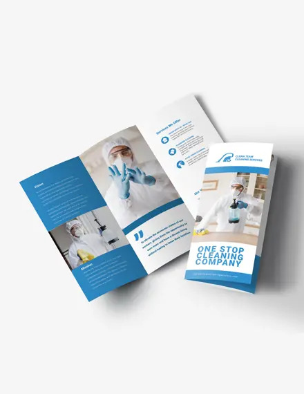
Neat Cleaning Services Brochure
Small to medium-sized businesses can benefit greatly from using brochures to promote their services to the local community. For example, this brochure template allows cleaning companies to present their available services neatly. It offers a tri-fold layout, classic fonts, and a blue and white palette to symbolize cleanliness.
The presence of various photo sections on the layout makes it easy to organize the content within. By dividing the information into small parts, cleaning companies won’t have to worry about overwhelming the reader. Accompanying the straightforward layout with an eye-catching cover also ensures that the brochure will be impossible to miss.
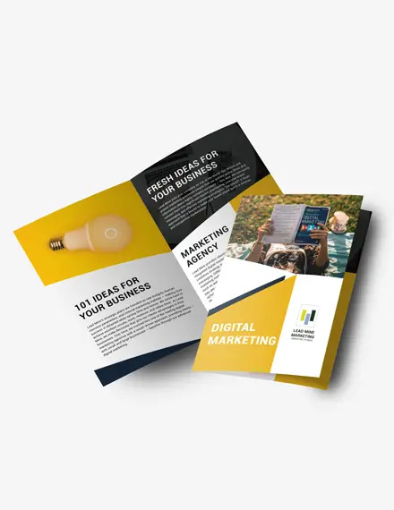
Sleek Marketing Firm Brochure
Aside from promoting one’s services, brochures also function to introduce the reader to the company as a whole. Marketing firms can do just that with this tri-fold brochure featuring a sleek layout and bold yellow and black design.
The geometric shapes created by differing colored backgrounds increase the readability of the brochure. They also provide ample space to showcase the firm’s representative photos alongside the information they want to share with the readers.
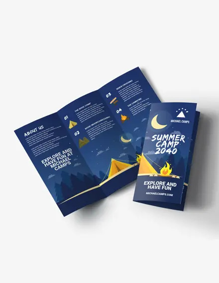
Youthful Outdoor Camp Brochure
Now that we’ve tackled business profiles and services, we can move towards another area that brochures do well in advertising: Events. Unlike flyers, brochures offer plenty more space to note details beyond the basic event title, date, and setting. You can include descriptions and even photos as well.
Given this feature, it’s only reasonable that sports leagues, volunteer groups, and summer camps utilize brochures frequently. Those wanting to do the same can take inspiration from this outdoor camp brochure, which offers a youthful look comprising an illustration of a camp under the starry night sky.
The dark blue background paired with the bright writing and yellow accents make an attractive brochure that will undoubtedly draw the eye. The tri-fold layout and spacing also give the reader an easier time digesting the information within the brochure.
Modern Apartment Sale Brochure
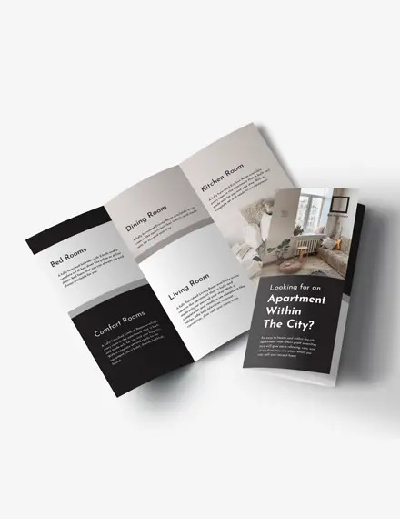
Realtors and real estate companies can also efficiently advertise properties for sale with the help of brochures. Those looking for a clean, modern design need not look further as this template offers just that.
The tri-fold body creates a clear divide between any room to be depicted on the brochure. Paired with the neutral palette and standard print fonts, this layout makes a brochure design that’s striking and highly readable.
Healthy Restaurant Brochure
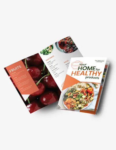
Traditional marketing tools like brochures are interesting because they can easily function as another device. See this restaurant brochure, which also acts as an attractive menu that one can easily hand out in public.
The bi-fold design is reminiscent of a traditional menu and creates a larger space to showcase both photos or illustrations and the menu list. In this template, one side features a photo background with a solid frame depicting the food items. Right next to it is a much more minimalist side containing ample space for various food images. The plain background also allows for multiple food categories to be listed.
The To-Do List for Effective Brochure Designs
It doesn’t matter if we’re starting a design from scratch or using a template; we still need to know about the proper process to create effective modern brochure designs.
✓ Refine the content
The foundation of an effective brochure design is its content, so knowing what we want to do with our brochures is the very first step in the lengthy design process.
While contemplating our topic, we should also keep in mind our target audience. Doing so allows us to fine-tune the written details, from the tone used to the copy length.
Some tips to keep in mind while planning the content:
- Get straight to the point. This is a brochure, not a book, meaning there’s less space. Including too much information will make the content look too blocky and may even confuse the reader.
- Don’t use big words. Some people have it in their heads that big words make copies appear more intelligent. Often, it results in a negative impression as the content will be too complex for the average reader.
- Add a call to action. Beautiful brochures may move the reader, but they don’t automatically have them do whatever we want them to do. Hence, the need to include a call to action in our content. Phrases like “Discover here,” “Shop now,” and “Sign up” are prime examples of calls to action that are typically accompanied by vital information regarding the company, event, or product.
This first step is essential to the entire design process considering the brochure’s content-driven nature. Skipping it or just stopping with a topic can negatively impact our brochure design later on. Moreover, it may result in more time and effort wasted if we have to revise the content while settling other design elements.
✓ Talk to your audience
Now, the brochure is only one small part of our brands. If we’re looking to advertise our companies or organizations with brochures, it will do us well to note any and all brand elements we can incorporate into the design. Company colors, logos, and even slogans can help create a more cohesive design.
Knowing our audience is also imperative for this part, especially if we’re looking to advertise other matters. For example, creating a brochure addressed to kids and their parents for a summer camp will yield success if we opt for a youthful and fun design. One that either showcases photos or illustrations of the location and activities to be had.
✓ Try new things

We have free rein when designing our brochures, so why not let our creative juices flowing?
Having even a vague idea of what we want our brochures to look like will make things easier when choosing elements to include in our final design. Illustrations versus photos, bright palettes versus neutrals, free form or constrained layouts—these are only some of the many decisions we need to ponder while designing.
Playing around with elements is one way of figuring out which elements pair well with others. We can also study existing modern brochure designs, something that template users already have a headstart on.
Taking the time to do so can lead to better design choices. We should be careful to only take inspiration from these brochures, though, and not lift anything directly. After all, original and unique designs have the edge over brochures that resemble others.
✓ Know when to stop
It may seem contradictory to the last point, but we should practice some restraint as well.
Like dense content, too many design elements can and most likely result in a finished product that is too overwhelming for the reader. Plus, it may even lower the attractiveness of our designs.
This is why we need to limit the elements we feature on our brochures. For example, if we’re using a photo background, there’s no need to incorporate other design images. Another consideration: too many varying fonts may create an illegible brochure. It would be better to just use one unique font for important details (e.g., the headline), while the rest of the brochure comes in a standard, neat typeface.
✓ Make it a keeper

Just as they are pocketable, brochures are also easily disposable. So, we need to consider the ways to make our brochures worth keeping.
It can be using the right colors and fonts, featuring unique photos or illustrations, or even using high-quality materials to print our designs. Regardless of our final choices, our brochures should possess qualities that make the readers want to keep them around.

