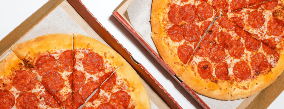
National Pizza Day is the best time of the year for pizza restaurants. Not only is it a great time to sell some pies, but it’s also the perfect time to get your name out there and create some loyal customers.
Those looking to do this need to take a hard look at their branding and their promotional material. This not only applies to the content but the design as well. Experienced restaurateurs even suggest using unique menu designs to represent different holidays and occasions should the branding permit it. Take, for example, pizza-themed menu designs for the most-anticipated National Pizza Day. We can even accompany the temporary menu with flyers or vouchers to further promote the holiday.
That said, there is no need to break the bank for design to be used on a short-term basis. Sometimes, a graphic designer’s services aren’t needed considering our access to design templates—the so-called crusts in the world of design. They’re eye-catching, effective, and not to mention easy on the wallet.
How to Choose the Best Template for National Pizza Day
It’s common knowledge that there is an innumerable amount of design templates online. Even if we do narrow down the templates based on the needed document or specific search terms (in this case, National Pizza Day templates for menus, vouchers, or flyers), we’ll likely end up with too many to choose from still. Treat it like we’re entering a pizzeria and getting overwhelmed with the number of pizza sauces and toppings available.
There’s no reason to fret, though, since we can make the selection process quick and easy. All we need to do is first consider what we want to get out of the templates. Deciding upon key characteristics early on can lead us to what is essentially the best “crust” for our business.
1. End goal
We have mentioned three branding and marketing elements in the previous sections: Menus, Vouchers, and Flyers. Thinking outside the box allows us to have overlaps in design and functionality, like a flyer in the form of a menu. Still, it’s best to limit the template to one purpose so we can arrive at a better and overall cleaner design.
2. Layout
It’s easy to mess up any design template layout if we don’t finalize the content before entering the editing stage. So, we’ll need to know what we’re inserting into the design early to lessen the time spent arranging information and accompanying graphics later on.
Content, in this regard, typically includes our logo, the tagline for the event, and supporting body (i.e., promo details, restaurant information, date and time, etc.).
3. Illustrations
Photos, sketches, and other illustrations—not every branding and marketing element features these visual components, and we aren’t required to use them either. However, those who are thinking of including some should use owned photos as much as possible. It can be something that the restaurant staff has taken or a stock photo purchased online.
4. Colors
Much like the images, colors serve to draw the eye and keep it on the design. We are often encouraged to use our restaurant colors on our branding and marketing materials, but special occasions sometimes call for us to deviate from the norm. In this case, colors reminiscent of pizza (e.g., red and yellow) will do wonders for National Pizza Day.
Having concrete ideas for the final output, or something close to one, will also give us a better idea of which templates will work in our favor. Now, without further ado, let’s explore some of the best “crusts” (read: templates) TemplateMonkey has in its catalog.
Recommended reading: Bottoms Up! 13 Drink Menu Templates to Impress Your Customers
Which Pizza Template Is Right for You?
TemplateMonkey has no shortage of design templates. The pizza-themed templates alone show a wide array of styles that can appeal to every person’s unique tastes.
Below, we have curated a couple of design templates that range from bright and dynamic to subtle yet still eye-catching, all of which are available in multiple formats.
Menus
1. Vibrant Pizzeria Menu
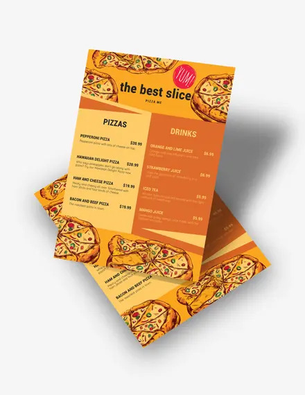
First in our collection of menu designs is a template that’s impossible to miss. This Vibrant Pizzeria Menu is perfect for National Pizza Day not only because of its name but also because of its stunning use of colors and graphics in the design.
The predominantly yellow and orange design features a two-toned body that creates a clear separation between meal groups. Partnered with clean fonts, this body makes it easy for customers to peruse the content. Completing the design are the scrumptious pizza graphics that will indeed have customers hungry for the real thing. It also comes with a bonus “Yum!” logo stamp.
2. Classy Italian Restaurant Menu
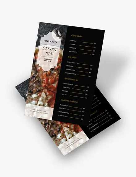
This restaurant menu was crafted for Italian restaurants but can quickly be revised for National Pizza Day. It’s perfect for restaurants looking for a design that exudes understated elegance, given the muted color scheme and classic fonts. The body, divided into two, offers a photo slot that can showcase the best-selling pizza flavor. Atop this photo slot is an elegant frame to house whatever the user desires. Next to this photo slot is a plain side where users can cleanly list down the restaurant’s offerings.
3. Enticing Pizza Store Menu
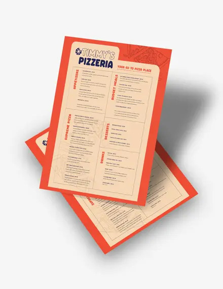
Next on our list is an enticing pizza store menu that makes use of illustrations instead of photos. The file folder cutout in the middle of the layout is adorned with food illustrations, calling attention but not detracting attention from the menu content. This cutout also features sectioned parts, allowing users to plan content easily, especially paired with neat fonts. Finally, the side headers further highlight the separation between food groups.
4. Modern Italian Restaurant Menu
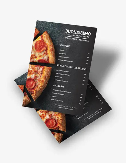
Last for our quartet is a modern restaurant menu template that offers a clean, sleek look comprising minimal elements. The most noticeable of all is the photo background featuring the classic pepperoni pizza on a black countertop. Alongside this photo is vast amounts of free space that makes it easy to organize the content however the user wishes to.
Pairing the dark background with a standard serif typeface helps creates a design akin to a chalkboard, perfect for establishments going for a special menu.
Vouchers
As previously mentioned, we can use other documents to spruce up our branding and marketing, especially if we’re trying to achieve such a feat by promoting a memorable holiday like National Pizza Day.
Following up are three voucher design templates that show that we can go beyond the use of graphics and images when keeping in theme for certain holidays. If the branding allows it, we can even use specific color palettes to complete the design.
1. Pizza Parlor Voucher
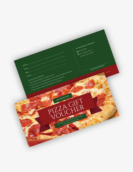
This Pizza Parlor Voucher is one such example of using a color palette to celebrate a given holiday. The red and green scheme is reminiscent of pizza slices, which also works well for the pizza background found in the voucher’s front. Meanwhile, the backside features a plain green background that perfectly showcases the voucher details when paired with a neat typeface.
2. Sleek Pizza Place Promo Voucher
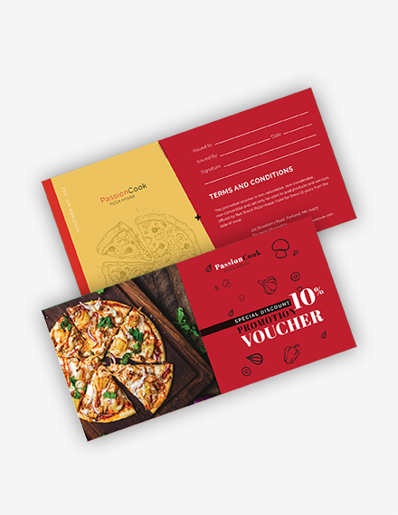
The collection’s second voucher design is what we consider a triple threat. It features a unique and cohesive look comprising a yellow-red color palette, a pizza image, and pizza-themed illustrations on both sides of the voucher. On the backhand side, we see a two-toned background, with one side allotted for the voucher details. Written information comes in a white shade to add a pop of color to the design.
3. Red Pizza Discount Voucher
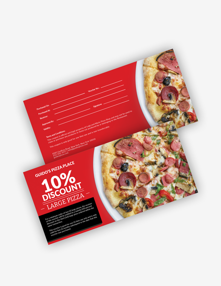
We go back to something more simplistic for the final voucher template. This Red Pizza Discount Voucher comes with a predominantly red design that pairs well with the Pepperoni Pizza featured on the template. Clean, blocky fonts are used to neatly layout the voucher details. Additionally, a blank frame is situated at the front of the voucher to highlight important information further.
Flyers and Brochures
Besides vouchers, we can also utilize flyers and brochures to promote this special holiday. Flyers, unlike vouchers, need not contain too much information, so they often come in simpler styles compared to other marketing and branding elements.
1. Appetizing Pizza House Flyer
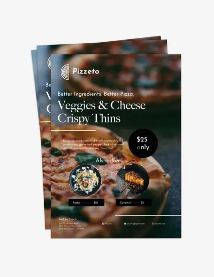
Looking for a flyer template to celebrate National Pizza Day? Or just to promote your Pizza House in general? This flyer template is as appetizing as they come, offering a photo background of a mouthwatering pizza dish. The straightforward format and standard, neat fonts it comes with make it easy for the viewer to read the content. Plus, the option to add more dish photos or promo numbers is readily available, thanks to the solid shape guides present in the layout.
2. Cool Pizza Parlor Flyer
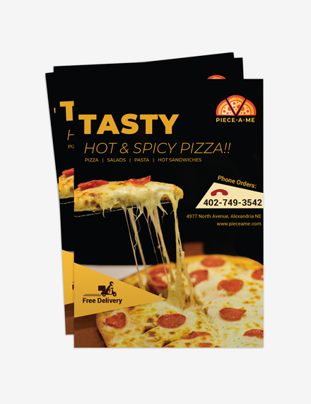
Another template we can use is this Cool Pizza Parlor flyer, which instantly tells the viewer its purpose at first glance. Such a feat is achieved thanks to the cheese pull pizza slice acting as a backdrop. It’s been paired with small geometric that highlight key details, like restaurant numbers or delivery options. Finally, the combination of thick and thin font faces create an attractive, clean look that’s impossible to miss.
3. Pizza Shop Menu Brochure
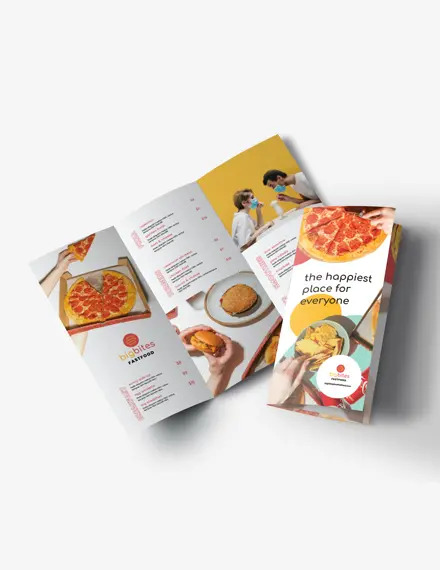
Here we have a menu-brochure template design for Pizza Shops looking to display and promote an extensive menu selection. The tri-fold template comes with a plain white background that allows the content to speak for itself. There is also ample free space in the design, giving users plenty of room to organize photos alongside written details. In this template, the outer side showcases various Italian cuisine, including pizza, to highlight the restaurant’s specialty.
Eager to check out more designs? TemplateMonkey has plenty more to offer. All that’s left to do is specify our chosen keywords to unlock all the templates in that category.

