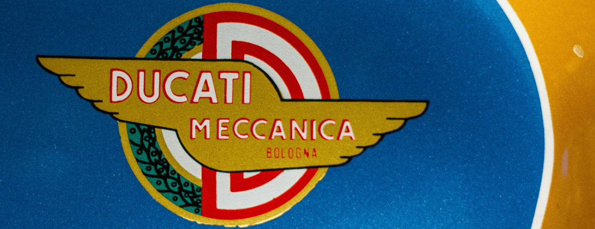
Over the years, a vintage logo design has been overlooked and frequently considered obsolete, looking old, ugly, and dull. But we have seen a return of their popularity in 2021, and we predict they will continue to make appearances over the next decade.
A vintage logo design is a style that is densely determined by art deco, which is a line graphic balanced with rich tones and clean surfaces. Its resurgence as a popular choice for business logos could be due to a nostalgia for old and vintage styles also seen in film, music, and fashion. Therefore, it is not a surprise that more businesses are tapping into their vintage vein to find a nostalgic-looking logo.
The Appeal of Vintage
To the amateur’s eye, numerous logo designs may appear similar to each other. They may say it’s only crafted with shapes, specific colors, and a unique font. Be that as it may, to a professional logo designer, there are many distinctive logo styles, and one of these is the vintage logo design. Enticing nostalgia is the essential key to creating a vintage-inspired logo design. When clients know about an item and affectionately think back on their relationship with it, a vintage logo design is an approach to gain that relationship. When you’re aiming for a vintage-inspired branding, it can likewise broadcast that you’re well established in your industry. At the point when a brand arrives at a specific degree of industry blow, changing its branding can sabotage its popularity.
If you’re a small business owner who’s looking for a budget-friendly bespoke logo design, then TemplateMonkey would be more than happy to help out! We will guide you on how to nail a vintage logo design for your small business, and TemplateMonkey will make it easier for you to create logo templates in 2021!
How to Create a Vintage Style Logo
Vintage logo designs are a great way to catch the attention of a group of people of any age as long as they are designed in a credible and authentic retro way. A vintage logo design can place clients into a perspective where they’re strolling through their favorite places of the past, forming a positive relationship between your item and the client.
A vintage logo design is also known as a classic or retro style logo. This design will frequently incorporate a minimal color palette of only one to three tones dulled or toned down. You can see vintage logo designs anywhere from coffee shops, restaurants, and boutiques to breweries and pubs. The vibe of these vintage logo designs may seem complicated, but rest assured that designing a vintage logo is easy as pie, especially with the help of TemplateMonkey.
Looking for logo templates in 2021 just got more convenient! If you are on a tight budget and want to create your logo for your company’s branding, we are more than happy to help you! With TemplateMonkey, you can create logo templates easily, in the comforts of your home. TemplateMonkey offers free professionally designed templates that are ready-made where you can download them for convenience. Just register for an account, and you will immediately get access to these templates!
Listed below are a couple of tips on creating your vintage logo design with TemplateMonkey.
1. Decide on the shape
First of all, you will need to figure out what shape you would like for your vintage logo design. Keep in mind that a vintage logo design generally incorporates both a text and a picture inside the shape’s edge. Some of the most popularly used forms for vintage logo designs are circles, triangles, diamonds, and ovals.
2. Decide on the color
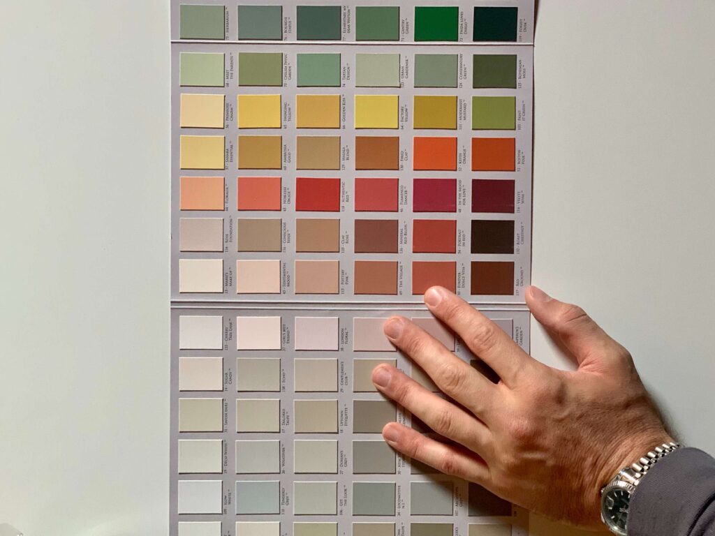
The next thing to do is to pick out a color palette or a color theme. Planning your vintage logo design with colors is an exhausting and fun activity. Engage in conceptualizing your brand as you choose what tones to pick, how the shadings will look together, and where to utilize which tone. To make the perfect shading palette for your design, you need to do a great deal of testing!
Try to limit the number of colors to a minimal selection to keep the vintage look for your business logo. Some of the most prominent logo professionals suggest picking a dull tone and a light shading to help make your organization’s name and slogan attract attention more against a background. But it’s really up to you as well! You can have the option to pick a light foundation and dim content or a dim foundation with light-hued text.
3. Select a symbol
A vintage logo design typically incorporates a symbol that is situated in the focal point of the logo. This symbol ought to portray what your business can offer to clients precisely. Make sure to keep this symbol simple and straightforward. Keep in mind that there won’t be a lot of shadings and colors included in the logo. A two-dimensional symbol is preferred by numerous organizations to display in the focal point of their logo.
4. Select a font style
When perusing around for the excellent font style to use for your logo, remember that vintage logo designs are renowned for their strong, huge, and retro-looking typeface. Choosing the perfect font style for your logo may be difficult because there are many vintage font styles to choose from, but keep in mind that the perfect font style for your vintage logo needs to fit inside your logo’s border shape.
It would help if you utilized text styles that depict a vintage feel while ensuring that your font style isn’t hard to peruse. Ensure that the font style you pick isn’t excessively muddled or dull. Furthermore, it should display striking typography.
You may also want to imagine your logo on different surfaces, for example, shirts, backpacks, mugs, and other branding materials. If the font style isn’t legible enough from afar, you miss out on brand recognition.
5. Select your frame
The frames utilized in vintage logo design include a few lines of shifting widths and patterns. The lines can be straightforward or have curves and ornamentations. You will see twofold lined frames of various shapes in most vintage logo designs—these shapes include ovals, triangles, circles, and other tweaked shapes.
Recommended reading: How to Design A Logo Design for Beginners
6. Add a ribbon
Another adorning component that can be found in vintage logo designs is a ribbon. It is either utilized in a straight or curvy manner. Normally the ribbons are the base for additional content other than the name of the brand. For example, the slogan or the date of establishment of the organization is perfect for a ribbon.
7. Sketch illustrations
As you can see in most vintage logo designs, they don’t have perfectly straight lines. Instead, the drawings resemble outlines and sketches with soft strokes in changing lengths and weight to give an appearance of shadows and highlights.
8. Curvy ornamentation
Another significant element of most vintage logo designs is an ornamental vector. Professional logo designers usually add sophisticated themes or twirls to give their design an antiquated allure to captivate their client’s attention. In most vintage designs, you can see that these aesthetic and creative lines are twisted, curved, and frequently plaited.
These ornamentations can be light or detailed, depending on the necessities of your organization. Always keep in mind that some designs with embellishments are not vintage, so you need to take into account different components.
9. Determine design details
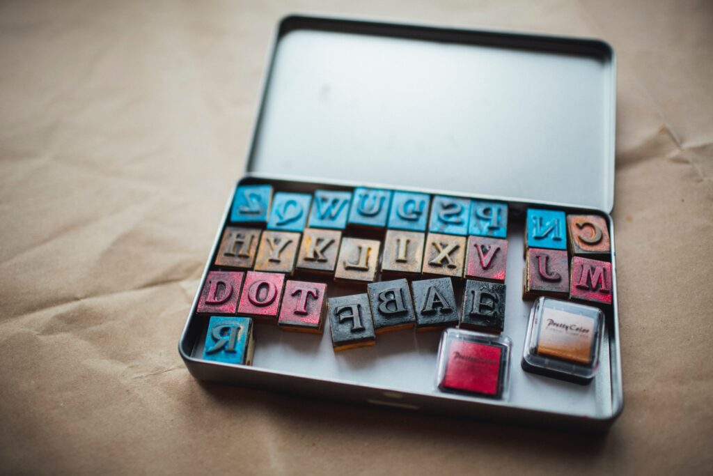
Vintage logo designs have subtle pattern details, as frequently seen in other businesses. Some of these subtle figures are stars, dashes, dots, or any other design patterns that help catch the client’s attention right around or across your business logo.
Adding extra impacts in vintage logo designs like flares, sheen, and so on will make your design attract attention and look less formal. So play around with your design’s textures, gradients, and layers. Don’t be too fascinated with it, though! Remember that your enhanced visualizations should go in a state of harmony with your chosen retro font style and symbol.
Prominent logo professionals suggest adding these figures around the edge of the logo or inside an internal boundary.
10. Use noise
Make your logo have the look and feel of a vintage logo design. To do this, add a noisy gradient to your vintage logo design to make it look aged in a classic way. That way, clients will have the look and feel of a vintage design that will surely bring back nostalgia.
Get Your Vintage Logo!
If you’re interested in creating your vintage logo, check out TemplateMonkey right away and choose your vintage logo design! Once finished, you can then publish it to your company’s website or Facebook page for branding. A logo is vital in every organization because it is at the forefront of your business. Venture into the world of beginner graphic design with TemplateMonkey today!

